From a marketing perspective, the Fourth of July must be like Christmas to Nathan’s Famous.
That’s the day Nathan’s hosts its annual hot dog eating contest on Coney Island in New York, where contenders down scores of hot dogs in their quest for the mustard yellow championship belt. The event has become a cultural phenomenon in recent years. This summer’s contest, in which the defending champion retained the title by downing 74 hot dogs in just 10 minutes, drew millions of eyeballs to the live broadcast on ESPN.
The contest is a spectacle, to be sure, but for those not on the East Coast it could also be their only exposure to Nathan’s all year. The New York-based Nathan’s, though, has a larger claim than encouraging digestive feats of wonder. The company sells hot dogs in grocery stores in addition to its nearly 300 quick-serve restaurants. Most Nathan’s Famous locations operate on the East Coast but the chain sprinkles some units across the country and even overseas, according to Phil McCann, senior director of marketing.
The brand’s geographic concentration makes sense. Nathan’s started on Coney Island 102 years ago and has since become a New York institution. Nathan’s Famous simply moved down the East Coast as New Yorkers themselves did.
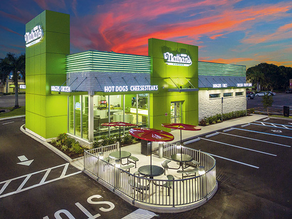
No brand, though, can live forever on a legacy customer base. Nathan’s leadership recognizes this fact and, with that in mind, introduced a new prototype in Cape Coral, Fla. The restaurant’s design strives to appeal to a younger audience while maintaining ties to loyal customers. At the same time, its smaller footprint and more efficient kitchen helps the restaurant better accommodate off-premise diners, especially drive-thru guests.
“We’re an old brand but we don’t want to be old and tired,” says McCann. “We need to be a little more contemporary and appeal to as many guests, young and old, as possible.”
Contemporary and Comfortable
Nathan’s more contemporary appearance starts with its exterior. The chain’s signature colors have long been yellow, red and green (or mustard, ketchup and relish, if you prefer) with yellow being the dominant color. While the redesign uses all three colors, the building now features a vibrant green meant to catch the eyes of those driving by.
The building’s facade features towers in Nathan’s signature green, with the logo on top. The structure also has a set of LEDs that can display green, as well as colors for other events, such as red, white and blue for the Fourth of July.
Exterior signage communicates its menu. “We’re more than just hot dogs. Some people don’t necessarily know that. On the outside of the restaurant we say hot dogs but also cheesesteaks and seafood and burgers and fries. We’re purposely putting those out there to communicate menu variety,” says McCann.
Green serves as a major color on the restaurant’s interior, as well, appearing most conspicuously on the restaurant’s Heritage wall. Here, glossy green laminate serves as the backdrop for a collage of historical Nathan’s photographs. These images include pictures of the company’s founders and a well-known Nathan’s restaurant in Oceanside, N.Y.
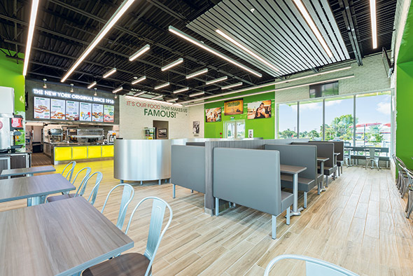 Nathan’s new interior includes soft seating and elevated finishes to encourage guests to stay and enjoy their food.
According to Oliver Powers, the chain’s senior director of franchise operations, these images also appear in every free-standing and in-line Nathan’s restaurant. Here, they serve as a connection between old and new. “We look contemporary and modern, but they left enough elements where you look and say, ‘aha, I get it.’ The people that know us say ‘It’s still the Nathan’s I know. I see pieces that I recognize,’ ” he adds.
The design features some more subdued elements, too. Wood grain porcelain tile serves as flooring, while a green painted Nathan’s logo splashes across a white brick wall. The chain introduced soft seating in gray, which appeals to both older guests who want comfort and younger ones who tend to linger. Seating areas also feature charging stations.
While the chain improved its seating, it also limited the total number of seats. Though the Nathan’s model can work in anything from a few hundred to a few thousand square feet, says McCann, the prototype store measures about 3,000 square feet and has just 77 seats. Some legacy restaurants, meanwhile, measure more than 5,000 square feet and have room for three times as many guests.
This smaller footprint and fewer seats mean the company must boost its drive-thru business in order to make this new prototype viable.
Drive-Thru Design
Instead of listing all of Nathan’s combo meals, a drive-thru preview board shows only pictures of the main offerings, like burgers, chicken sandwiches and hot dogs. This encourages guests to quickly decide on the basics of their meal before they pull up to the main menu to place their order.
The main menu board, meanwhile, includes the chain’s combos. It does not list all of Nathan’s offerings, though. Items like chicken wings and cheesesteaks, which take longer to produce, do not appear on the menu in an effort to speed service. When guests place an order that takes a particularly large amount of time to produce, team members can direct them to pull into drive-thru parking stalls, allowing customers behind them to continue to move through the line.
A redesigned kitchen supports both drive-thru and dine-in guests.
Speedier Kitchen
The previous design used a horizontal kitchen, with the production line parallel to the ordering counter in the front of the house. The new prototype’s kitchen is vertical, meaning it sits perpendicular to the ordering counter.
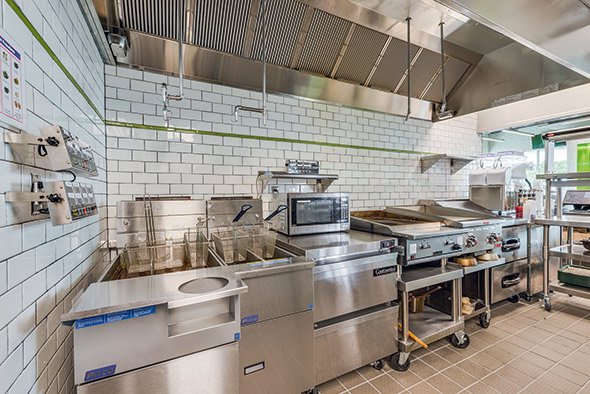 The chain uses two fryers, one for seafood and one for other fried items, such as corn dogs and wings.
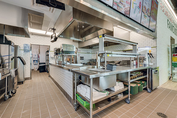 Nathan’s reworked its expo station to provide easy access to both dine-in and drive-thru staff members.
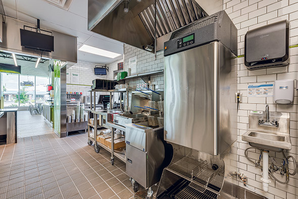 A new fry-only fry station, with fry dispenser and dump, allows drive-thru staff to access everything they need in just a few steps.
With this change, menu items now make their way from the back of the kitchen to the front expo area during the assembly process. This allows kitchen staffers to place finished items in one of two places at the end of the production line: the dine-in/carry-out expo or the drive-thru expo.
Both expo stations have everything staff need to finish assembling a meal. In addition to a kitchen display monitor, napkins, sauce, packets, etc., each station also has a set of hot wells for hot dog toppings like sauerkraut and chili.
A reworked and relocated french fry station supports this setup. It’s now closer to the drive-thru window but is still easily accessible for staff handling dine-in service. This station features a two-basket fryer. To the right sits an upright fry dispenser, followed by a hand sink and ice machine. On the left of the fryer is the fry dump station, followed by wells holding hot toppings for fries.
The changes result in a much more efficient space for drive-thru staff, Powers says. In the previous design, these team members had to cross over into a workspace designed to serve dine-in guests. This led to traffic jams and wasted steps. Now, drive-thru staff have everything they need nearby.
“If you look at it, it’s a very small triangle,” says Powers. “I stand there and get my fries, turn around, get my hot dog, top my hot dog, turn around and serve it. My drive-thru people are doing the whole thing.”
In addition to designing a drive-thru section, the Nathan’s team also made some adjustments to the main production kitchen.
This kitchen starts with two fryers, each with two baskets. The first is dedicated to seafood items like fried fish, fried clams and fried shrimp. Notably, these offerings appear on the menu under the Arthur Treacher’s name, which Nathan’s owns. A fish-and-chips restaurant, the majority of stores are now co-branded with Nathan’s Famous. A two-drawer undercounter freezer holds these items near the fryers.
The second fryer cooks Nathan’s-branded offerings that include chicken strips, chicken wings and corn dogs. The split-vat fryer avoids any flavor crossover.
Precooked items share some space with the seafood undercounter freezer or sit in the two-drawer undercounter freezer immediately to the right. The surface of this freezer next to the fryers doubles as a workspace. When food is ready to come out of the fryer, staff dump the items into transfer trays sitting on that unit.
This process, says Powers, prevents grease from dripping on the floor and makes the movement of food easier in a tight space. “We don’t cross over with the basket. We make them use a pan to move it across [the aisle] to the holding units,” which sit 180 degrees from the fryers.
Back on the main hot line, Nathan’s makes additional use of the space above the undercounter freezer next to the fryers. There, a shelf holds a microwave, which staff use to “take the chill off” corn dogs before they go in the fryer. This, Powers says, ensures the interior cooks all the way through without overcooking the breading.
This undercounter freezer next to the fryers also holds proteins for the next two pieces of hot equipment. First comes a two-foot chargrill, where line workers make hamburgers and chicken sandwiches. As with food from the fryers, the items coming off the chargrill go to the warming unit on the other side of the aisle.
Following that piece is a two-foot flattop where cheesesteaks cook. Because cheesesteaks require melting cheese on beef or chicken hot off the grill, Nathan’s does not store these meats in the holding unit. Instead, staff make cheesesteaks to order, with the peppers and cheese held in cold wells on a sandwich table immediately to the right.
While the hot line ends with the cheesesteak sandwich table, the order assembly line starts with the previously mentioned holding unit, which sits above the undercounter freezer that holds seafood. While the holding unit is the same size as before, to match the speed the drive-thru requires, Nathan’s now holds more proteins here, notes Powers.
Following the holding unit comes a refrigerated table with cold wells that store ingredients for burgers, sandwiches and salads. An undercounter refrigerator holds backup ingredients, while overhead shelving holds the buns. This shelf also holds a toaster for sandwich buns.
Next comes a small worktable with a built-in shelf that holds another toaster. This second unit becomes necessary, says Powers, because hot dog buns toast differently than sandwich buns.
Following that worktable comes the hot dog grill, a custom-made four-foot flattop. The grill sits at the end of the assembly line, across the aisle from the sandwich table that holds cheesesteak toppings. The refrigeration below that table stores hot dogs prior to cooking. That’s a change from Nathan’s previous design, where hot dogs were held next to the grill in an undercounter unit.
The chain shifted the storage due to space constraints, Powers said.
The production kitchen takes up the bulk of Nathan’s non-dining room space. The new design does have a small prep area, though, consisting of a worktable with overhead shelving and some smallwares. Most of Nathan’s prep is simple, Powers points out. The chain does use a vegetable slicer for some produce, but the remainder of the prep work involves opening cans and bags.
Future Focus
With the new restaurant prototype operating for a few months now, the chain’s drive-thru focus seems to be a success. According to Powers, drive-thru sales at one legacy restaurant near the new prototype can’t crack 25 percent. In its first few weeks, the new prototype store hit the chain’s target of 40 percent drive-thru sales.
The hope is that the smaller, less expensive building and strong drive-thru sales will push franchisee interest in the brand. Nathan’s has a strong presence along the eastern seaboard; growth targets now include the southern U.S. and international markets.
Nathan’s Famous at a Glance
Key Players: Eric Gatoff, CEO; Don Schedler, vice president of architecture and construction design; Oliver Power, senior director of franchise operations; Phil McCann, senior director of marketing
Facts of Note
- Chain Headquarters: Jericho, N.Y.
- Year Founded: First restaurant opened in 1916 on New York’s Coney Island amusement area.
- Signature Menu Items: Hot dogs, fries, burgers, chicken, seafood, lemonade
- Number of Units: Nearly 300 worldwide
- Unit Size (Prototype): 200 to 2,000 square feet
- Check Average: $13

