From the constantly changing dietary needs and wants of diners to the sanitation scares courtesy of the pandemic, it’s not easy being a salad station these days.
Even the definition of what constitutes a salad — and, by association, a salad station — has become much more complicated. But while some had predicted the pandemic-related salad bar closures would be permanent, the reports of their demise, as the saying goes, have been greatly exaggerated.
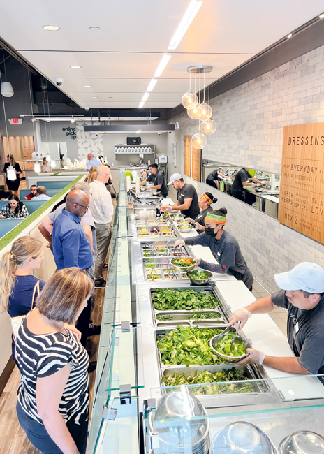 Since its inception in 2005, Salata has always prided itself on offering 50 different ingredients customers can choose from for its made-to-order salads and wraps. Options include an array of lettuces, vegetables, fruits, cheeses, seeds and nuts. That’s welcome news for self-confessed salad lover Laura Lentz, FCSI, design principal at Culinary Advisors. “What I’m seeing as a designer across the board right now is we are all trying new things and seeing how we can make it better,” she says. “The salad bar is just one example.”
For Lentz, who works with commercial and noncommercial clients, that has meant a return to traditional self-serve salad stations. “Some people really love and are committed to a traditional self-serve salad bar, where you put out all the toppings, everyone goes through a big line and it’s scale by weight,” she says. It has also resulted in more contemporary full-serve models. Lentz has also worked with clients who have wavered between the two and are looking for something different. “Out of the pandemic, salad station designs can’t be universal anymore,” she says. “They need to be very specific to each operation.”
For one healthcare operator, that meant putting a carving station at the end of the salad bar, which upped their protein selection and added versatility. “In that same carving station, we have opportunities to be located in multiple places around the servery space,” says Lentz. “We are really trying to make the design dynamic so that, as a customer, every time I come in, something can be different and set to whatever is happening that day. I believe salad bars are going to continue to play a huge role in that and become a great center of attention.”
When project manager Elijah Davis of Annapolis, Md.-based foodservice consultants Next Step Design (NSD) was tasked with creating the subsidized dining for Expedia Group’s new headquarters in Seattle, self-serve wasn’t an option, even for the salad station. Expedia didn’t want a cafeteria vibe, says Davis; rather, they wanted it to have more of a market hall feel. Additionally, part of the objective was to keep people moving and not give them the opportunity to linger.
That means at Expedia’s composed salad station, you won’t find traditional hot and cold wells. Instead, you’ll find stone-topped counters with thin pieces of that same material lining the wells. “Where you’d have a cold display case, we put stone liner on the inside,” says Davis. “You are seeing the same finish in the exterior counter as you are on the inside of the refrigerated area, which gives it a more curated and elevated look. It’s not so much stainless steel and softens that commercial feel.”
Complementing that visually appealing design are large Le Creuset-like ceramic bowls that are the serving dishes for the composed salads on the menu that day. Nearby add-on proteins offer some customization. Behind the salad station employee is a tall, glass grab-and-go case with shelves lined with ready-to-go composed salads, creating an eye-catching green wall of sorts, that serves as backup. “The biggest thing we think of when designing for this sector is the operator’s intention of how customers will be served,” says Davis.
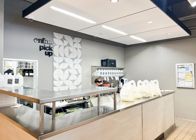 To better accommodate the shift in increased online ordering, Salata redesigned a prep area that mimics the experience of walking down the line of its front-of-the-house salad bar with all the same ingredients.
Houston-based Salata uses a similar thought process for its fully customizable, built-to-order salads and wraps concept, which has more than 80 corporate-owned and franchise locations in Texas, Georgia, Southern California, Louisiana and North Carolina. “When you walk into our restaurants, we’ve made sure there’s a clear line of sight for our customers, whether they’re new or returning, on where they should go,” says Michele Maerz, vice president of operations. “The natural design of our restaurants brings the guests right into queue for their in-person build, but additionally, they have a clear line of sight to our dedicated pickup area.”
Prior to the pandemic, Salata, which offers unlimited toppings for one set price with protein add-ons available for an additional fee rather than pricing by weight, freshened its decor. The chain also completed a tech suite overhaul, which was very serendipitous, says Julie Davis, vice president of franchise development, considering what happened in 2020 and how it affected this fast-casual dining segment. “For the past few years, we have shifted to a smaller dining room footprint, and we focused on enlarging our online pickup footprint to accommodate that shift,” she says. “For Q1 of this year, 83% of our sales were for off-premises dining.”
To adapt to that change in ordering, Salata’s back of the house was redesigned to incorporate a dedicated online order prep area that mimics the front-of-the-house experience of walking the line of the salad bar, which features 50 different prepared in-house ingredients. “Guests can use a customized order flow to create their meal online just as they would in the restaurant,” says Maerz. Salata continues to improve a curbside program in Houston to further accommodate online ordering with plans to roll it out at all their restaurants in the near future.
At Chicago-based Lettuce Entertain You Enterprises’ Beatrix Market, catering to on-the-go customers has been the focus from the very beginning, with locations specifically chosen in areas of high foot traffic. At its four grab-and-go markets, the self-serve hot-and-cold salad station occupies most of the front-of-the-house real estate of the stores’ small footprint, which typically ranges from 3,000 to 4,000 square feet overall. Making the most of the space is always top of mind. “This is very much a collaborative effort between the equipment design, the design of the space and a chef’s vision, so it makes sense on all fronts,” says chef partner Janet Kirker.
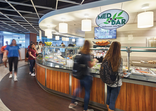 Creating salad bars with curves instead of sharp angles helps with flow, says Laura Lentz, design principal, Culinary Advisors, as shown at this Baltimore Loyola University dining facility.
Part of that design involves creating a logical flow for customers. “It has to be organized, clean and easy to navigate; otherwise guests will get frustrated,” says Kirker. Aisle width was also studied — not too wide and not too narrow — to aid in that flow while also creating energy in the space. Cashier booths are positioned in an easy-access row. “We are known for our smaller spaces and our fast-moving lines,” she says.
As part of its customized salad bar design, Beatrix Market incorporated a built-in place for its to-go containers. Time was spent redesigning the custom salad dressing bottle area to make it more user-friendly and attractive. “We have a hole of sorts that you can insert the bottle into, which means it can’t fall over, and it’s set into a refrigerated little pan,” says Kirker. At the end of the bar, there’s a cubby for hand wipes for those inevitable sticky-hand moments. “Those added conveniences for the guests have really made a difference,” adds Kirker.
For Lentz, leveraging the length of the salad bar is a design must for self-serve concepts. “Nothing jams up a self-serve salad bar more than a 90-degree angle where everyone has to stop and wait at that pinch point,” she says. “You want people to be able to walk the length of it, and you want it to be easy for someone to come in from behind and be able to refill items.” She is a big fan of curved or trapezoid-shaped salad bars. For a full-service station, however, making them as compact as possible is preferred to reduce the number of steps taken by the chefs and employees behind it.
For either concept, it’s important to consider the functional design of items such as breath guards, as well as cold and hot pans. “When my generation first started revamping the breath guard rules and limitations, I became intensely aware of how critical the ergonomics of a salad bar are,” says Lentz. This includes the reach of customers when in self-serve mode and the ability to hand someone a salad in full-serve mode.
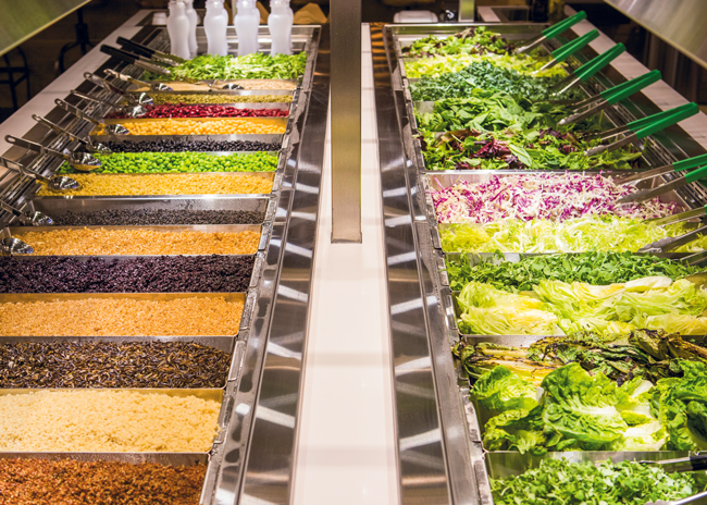 Beatrix Market recognizes that diners eat with their eyes first and strives to create salad stations that feature an abundance of colorful items displayed in a way that is organized, clean and well-lit.
Since it opened in 2015, Beatrix Market has featured an extensive selection of both hot and cold items at its salad station. Keeping ahead of changing diets and food trends is top of mind for Kirker. “Over the years, as our guests have become more adventurous, we have become more adventurous too,” she says.
To ensure the spicy chickpea stew, Greek chicken and fan-favorite macaroni and cheese, for example, retain their quality, Beatrix customized its serving pans with varying depths. “Everything we do, we size it to a pan because the challenge for a hot bar is the food has to taste good all the time,” says Kirker. “By design, we have looked at what makes our food look good and last the best, which includes putting it in appropriate-size containers and serving them with attractive tools.”
Lighting is another area of focus at Beatrix Market. “Everything is very well lit. It’s direct and warm lighting right over the food,” says Kirker. But that design element does come with a caveat: Be mindful of putting the spotlight on food that might be delicious but doesn’t look appetizing.
Lentz is also a big believer in the power of properly lighting a salad station. “Direct lighting can really bring out the positive aspects of the food,” she says. “There’s nothing more expensive than a salad bar you spend all this money on and it’s poorly lit.”
For NSD’s Davis, one of the biggest changes he’s seen when it comes to salad stations — specifically composed salad markets — is regarding display. “People want more of an elevated aesthetic,” he says. “We are seeing more of the jewelry-case type look with UV-bonded glass in the structure so that you don’t see metal going up the side anymore.”
Having equipment that is easy to clean is another concern at Beatrix Market, which means opting for pieces that don’t have a lot of crevices where bits of food can hide. “During the middle of lunch, you have to expect things to get a little bit messy, but you have to be quick to clean it up,” says Kirker. Additionally, Beatrix’s customized breath guards can easily be raised to ensure thorough cleaning on the inside and out.
Access to inventory and refrigeration is another important consideration for the salad bar station, says Davis. At Expedia, in addition to the grab-and-go glass refrigerated cases in the station, a walk-in refrigerator is less then 15 feet away. “Operationally, you won’t be happy if you’re paying your staff to walk around to get inventory,” he says. “We had to make a case for getting refrigeration and backup storage close to the station.”
At Salata, reach-ins underneath the salad station filled with ingredients in 32-ounce containers make it easy for employees to replenish when they run low. “The goal is not running to the walk-in during lunch,” says Maerz. “We don’t have time for that.”

