Like so many other hospitality providers, hotel restaurants have undergone an identity shift.
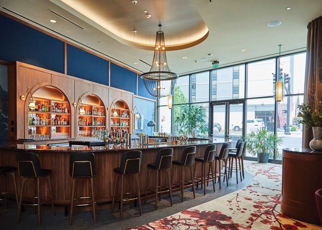 Chef Sean Brock’s recently opened The Continental located at the Grand Hyatt Nashville features a gallery of Brock’s own photography pieces on a wall of the private dining area. Hotel restaurants that exist mostly to execute private events or to serve travelers whose schedules or desires don’t include an exciting dining experience are becoming relics of the past. From a restaurant located inside a hotel on a tourist-friendly pier to those inside a converted beloved brewery, hotel restaurants — and the designers and culinary teams behind them — now embrace their unique settings and the opportunities they offer to create distinct dining venues for those spending the night and, just as important, those who aren’t.
But the process of creating a destination-worthy hotel restaurant that pleases everyone isn’t without its challenges.
“When you’re doing a restaurant in a hotel, the way you lead people through a space can either be really seductive and beautiful or it can be awkward,” says Smith Hanes, founder of Atlanta-based Smith Hanes Studio, a group of interior designers, architects and industrial designers whose work includes restaurants, hotels, retail, workspaces and personal residences.
For one of his recent projects, Hanes worked on the rebranding of Bullard Tavern in the Woodlark Hotel in Portland, Ore. Hanes also redesigned the hotel’s debut restaurant, Bullard, which opened in 2018. As part of that original construction, which married two side-by-side 1911 buildings, the floors first needed to be leveled. Hotel guests now seamlessly enter the restaurant from the lobby without navigating stairs, achieving an elegant flow between the two entities.
Additionally, Bullard Tavern features a prominent street entrance. “As a result, the restaurant faces the street and has its own presence. It isn’t just an also-ran restaurant,” says Hanes. “When I have to walk into a lobby to get into a hotel restaurant, it’s too many experiences at once.”
Two restaurant entrances, while preferred for hotel restaurant designs, do come with their own unique set of concerns. Take, for example, the renovated historic Hamilton Hotel in Washington, D.C.
“The street access front door is on the opposite side of the restaurant compared to the hotel access door,” says Joe Palminteri, area director of food and beverage for the Hamilton Hotel. “This element made the placement of the host stand come into conversation in order to ensure guests were greeted in the proper amount of time.”
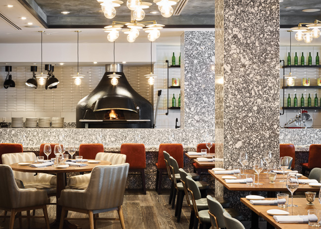 An 880-pound wood-burning oven handmade in Italy serves as a focal point at Via Sophia in Hotel Hamilton. A 10-seat pizza bar offers an up-close view.
Serving Two Distinct Customer Bases
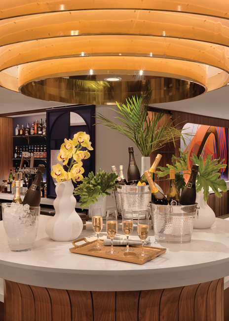 After a multimillion dollar renovation, Le Meridien St. Louis Clayton reopened with a focus on art to reflect its proximity to the area’s museums. That inspiration is carried over at Café La Vie, the hotel’s new French-leaning bar and restaurant. In the morning, the expanded bar provides a welcome spot for coffee drinks and pastries in the morning as well as cocktails, bubbles and snacks later in the day. As part of the multimillion-dollar renovation of the iconic 318-room 1922 Hamilton Hotel, an authentic osteria, Via Sophia, was created from the ground up. The restaurant includes a traditional Neapolitan pizza oven, imported from Naples, Italy, which serves as the focal point and was custom built specifically to fit into the dining room. Only a few short months after the September 2021 renovation, Via Sophia has established its own identity, which included an invitation for the chefs to participate in the Invitation to Cook program at the James Beard House.
A multimillion renovation was also recently completed at Le Meridien St. Louis Clayton, a 268-room hotel in the heart of the business district of Clayton, Mo., which features a curated art program of some 50 pieces throughout the public spaces and guest rooms. One design imperative at the Café la Vie was ensuring smooth transitions from one daypart to the next.
“Café la Vie has the ability to transition from day to night with a faux skylight,” says executive chef Michael Frank. “Once it hits 4 p.m., the lights are dimmed, which naturally sets the ambience.” Additional renovations included opening the previously enclosed dining room and building an L-shaped bar with additional seating, going from 10 seats to 25.
“During the week, we are a business hotel, so it’s important for us to incorporate some local dishes,” Frank says, citing toasted ravioli as one example. “We have to understand that, for people who aren’t from here, these are new dishes, and they’re excited to experience St. Louis.” He works to find the balance in the menu that acknowledges both the business traveler and locals.
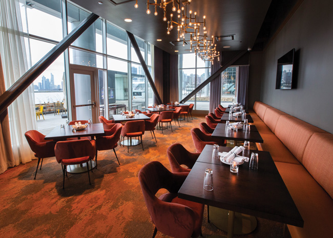 While set inside Sable at Navy Pier Chicago hotel, Latin-leaning restaurant Lirica maintains its own interior design identity, making it a destination for those staying in the hotel as well as a large numbers of locals.
Another hotel, the just-opened Sable at Navy Pier Chicago, creates distinct interior design personalities between the hotel and its Spanish-leaning restaurant, Lirica. The intent is that two entities each appeal to a unique audience. “There are two large customer bases for the restaurant, those on the pier and those staying in the hotel. We wanted to differentiate their designs for this reason,” says Stephen Stoll, chief operating officer of 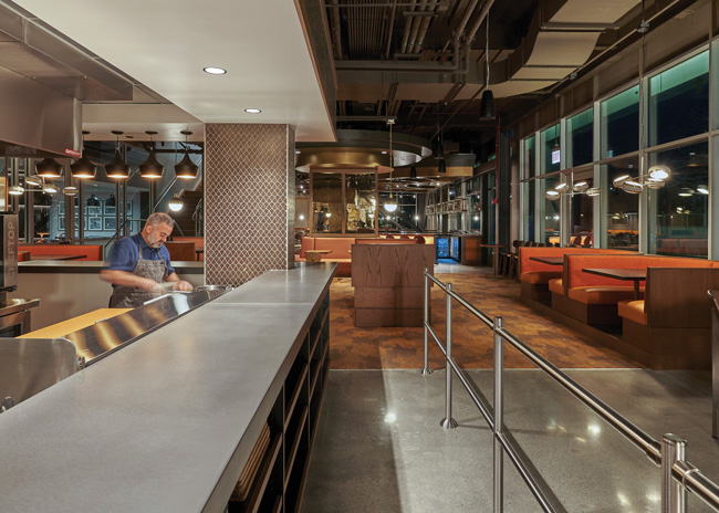 Sable at Navy Pierrestaurants for Maverick Hotels & Restaurants, a Chicago-based hospitality management firm. “While most hotel restaurants serve as an amenity to the hotel, Lirica does this while also catering to the 9 million people that come to Navy Pier on an annual basis.”
Two entrances to Lirica — one from the hotel and the other from the pier’s bustling pedestrian walkway — help drive this point home. Menu changes also play an important role. “It can be a difficult balance as the tastes and interests of a family visiting Navy Pier can vary significantly from a couple that walks to us from the nearby Streeterville neighborhood,” says Stoll. “Our menus have been and will continue to be an evolution until we strike that proper balance. Also, what we offer during the summer when it is high time for tourists at Navy Pier will differ substantially from the winter months when locals take advantage of the smaller crowds.”
{unitegallery photo_driven catid=45}
Le Meridien St. Louis Clayton
Well-Designed Hotel Kitchen Spaces
At San Antonio’s Hotel Emma at Pearl, a 146-room hotel set inside a 19th-century brewhouse, chef John Brand’s passion is so great that he approaches his role as culinary director and the menus of the hotel’s trio of restaurants (Supper, Larder and Sternewirth) as almost a calling. His motivation to work in hotel foodservice was to look out for the underdog because someone once told him that you can’t get good food in a hotel, says Brand, who has previously worked at other culinary-focused hotels, including The Little Nell in Aspen and The Broadmoor in Colorado Springs. “I’m still out to prove that you can.” By creating menu items that speak to the culture and heritage of San Antonio that are also easy on the wallet, the clientele of Emma’s various restaurants includes many loyal locals.
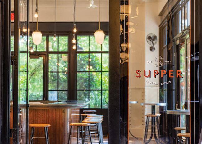 Image courtesy of Hotel EmmaAn open 3,000-square-foot kitchen, which handles all the restaurants’ cooking, including for private events and room service, helps Brand communicate easily with his 40-person team. “You can see everybody in the kitchen, including the dish station,” he says.
The kitchen also includes a large window at Supper. “I’ve made that transparency a part of our culture in that the guests can see us, and we can see them, and we are reflective of that. Our kitchen can’t be in chaos and vice versa in the dining room,” says Brand, who adds, “The ability of the back-of-the-house staff to see outside also helps their mental well-being.”
Lack of kitchen space is a common challenge at many hotel restaurants, and that’s especially true at Bullard Tavern. “When we were building out the kitchens, we had to consider all of the outlets and how much space that would require, as well as being in a very old building, which creates limitations on space and usage,” says executive chef John Baxter. “We had to be very clear about what equipment was dedicated to prep and what was dedicated to service and create two kitchens based on that setup.”
Below the restaurant is the 1,000-square-foot prep area, home to two combi ovens, two large proof boxes, a full-size pastry sheeter and a smoker, which serves as the workhouse of the kitchen, says Baxter. Upstairs is the finishing kitchen, which sits in open view of guests and includes a wood-burning oven more or less in the middle of the dining room.
To counter the low ceiling in the dining room, the walls and ceiling were painted the same color. “It’s a little bit of a theatrical thing we do, which helps people believe they’re in a more expansive space, when all walls are the same color,” says Hanes. “Your mind kind of blows the space open, and you imagine a room that’s more spacious than it really is.”
For Frank at Le Meridien, like many chefs, organization and detailed checklists become important tools when it comes to countering small back-of-the-house spaces as well as keeping up with the multiple culinary demands of running a hotel dining operation. “Everything has to be in its place and serve a purpose,” he says, and that includes the variety of smallwares such as glasses and plates. “You have to constantly look at things and assess if that’s the best way to do it,” he says. “If a piece of equipment would be better for operations if it was moved, don’t be afraid to make those changes.”
Part of Frank’s initial evaluation during the renovation included making improvements to the garde manger area. To add more working space, Frank drilled a pass-through window onto a stainless-steel table. “Now I can have an expanded dessert program as well as during lunch we can operate with more salads and cold items,” he says. To ease line operations, one area is committed to banquets with a dedicated convection oven and heating window. (Plans for a separate banquet kitchen are in the works.)
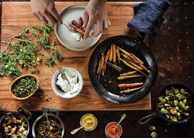 Image courtesy of Hotel EmmaAnother piece of equipment Frank swears by is a double-sided vacuum sealer on wheels. “Those are important for preserving products and protecting your investment,” he says.
With real estate a premium on Navy Pier, Lirica was designed with less back-of-the-house space than you would normally see in a free-standing restaurant and far less than what you’d see in a full-scale hotel operation, says Stoll. All of the prep for banquets takes place in the 1,500-square-foot restaurant kitchen, which is on first floor, and then staff bring everything to the second-floor banquet area. The equipment package in that second-floor 600-square-foot banquet kitchen includes a combi oven, roll-in refrigeration and a few roll-in prep tables that staff can configure based on the type of event and whether the service style is buffet or plated. “We try to keep the space pretty minimal and adaptable,” he says. Outsourcing several specialty items, including pastries and wedding cakes, helps save on precious kitchen space as well.
At Hotel Emma, to offset operations that were built smaller than current business levels demand, deliveries occur six days a week, says Brand. In addition, some crossover exists between the various restaurants’ menus. “We try not to be homogenous, but we do so deliberately sometimes because we have dishes guests like everywhere at the property, whether it’s at the pool, the bar or room service,” says Brand. Flexibility and restraint help when it comes to menu management, he adds.
Dealing with Bullard Tavern’s small kitchen means Baxter leans heavily on his prep kitchen and staff. “The prep team handles a lot of our big sellers, like smoked San Antonio chicken and monster beef ribs, while the service kitchen focuses on working with great ingredients and letting them shine without much alteration,” he says. A large smoker is a key piece of equipment. Additional equipment includes two combi ovens, two holding and proofing boxes, as well as a full-size pastry sheeter.
Tech Tie-Ins
During the pandemic, Le Meridien experienced an influx of to-go orders via online ordering from the neighborhood when the restaurant wasn’t open to dining. “For a hotel to capture some to-go outside revenue is very intriguing for us,” Baxter says. “If you can tap into that and get some consistent business from neighborhood diners and offices that’s a wonderful opportunity.”
At Le Meridien, an exclusive, integrated mobile dining platform allows guests to order food at the pool terrace as well as from their rooms.
Six years ago, when Brand pushed for order screens in the kitchen at Hotel Emma, not everyone was convinced the then-modern approach was the way to go. Now, he and his staff couldn’t imagine working without them. Besides being much more environmentally friendly than paper printers, the reduction of noise in the open kitchen, and their ease of use, has made them invaluable. Next up, Brand is thinking of tablet service at the bar and doing away with credit card machines at stations. “I really think America needs to get into that system, so the credit cards don’t have to leave the table or guest,” he says.
But technology, no matter how sophisticated, won’t solve every challenge that hotel restaurants will inevitably face.
“It’s important to have a good mix of talent on your team, both those with stand-alone restaurant experience and those with hotel experience,” says Stoll. “Oddly, kitchens are run very differently in these two sectors, both having pros and cons. It is all about finding the proper balance.”
And once that mixed team is in place, don’t underestimate the old-school art of relationship building. “Get to know the dynamic of the generation of people you would be hiring and what’s in their world. We aren’t always receptive enough,” says Brand. “Be open and vulnerable to change, opportunity and thinking differently.”
{unitegallery photo_driven catid=44}
Vivid colors, as well as bold patterns, add an unexpected edge to the sophisticated space at The Continental.
Nod to Historic Hotel Fine Dining
Sometimes the best way to embrace the future is to go backward. Or, at least, that’s the case at The Continental, the new restaurant from acclaimed chef Sean Brock located inside the Grand Hyatt Nashville hotel in the Nashville Yards development. Celebrating the unique history of hospitality and hotel fine dining through the 19th and early 20th centuries and Brock’s meticulous approach to classic American dishes, The Continental aims to make fine dining fun. Part of that entertainment factor involves custom service carts — made by a local artisan — that serve signature dishes tableside, such as prime rib with horseradish cream and natural jus, and vanilla bean custard cream with a selection of shaved ices and toppings.
The playful and sometimes theatric plating of the food reflects the restaurant’s location across from Nashville’s Frist Art Museum. Complementing the cuisine, the design by Nick Dryden of Nashville-based DAAD represents an homage to American hotel dining in the Golden Age with plush banquettes and large booths. Vivid colors such as red and citron, as well as bold patterns, add an edge to the sophisticated space. “The idea behind this restaurant is to embrace and be inspired by the original great American hotel restaurants and to invigorate the spirit of those historic dishes in a new way,” says Brock. “We want to remind everyone what makes going out to eat so enjoyable and exhilarating.”

