The small spaces and simple designs of coffee kiosks force the issue of a functional workspace.
How's that caffeine buzz going? For most Americans, it's going strong, getting stronger and the message to operators is clear: Keep it coming.
 Next-gen coffee kiosk Café X brings automation and maximum speed to the specialty coffee experience. Image courtesy of Café X
Coffee consumers now want and expect good coffee — make that gourmet coffee — anywhere, any time, and in environments that suit any mood and any occasion. While second- and third-wave coffeehouses provide the type of comfortable, third-place environments that nurture the coffee culture buzz, the need for speed makes smaller, more nimble formats a popular choice for consumers who just want their coffee and want it fast. Kiosks and drive-thru-only locations that fit in minimal square footage and in nontraditional sites feed that need, and consumption trends suggest demand for such on-the-go options will continue to grow.
The National Coffee Association's National Coffee Drinking Trends 2017 tracking report shows the percentage of Americans drinking coffee on a daily basis has increased to 62 percent, up from 57 percent in 2016. Younger consumers fueled much of that increase with their taste for gourmet varieties, but daily coffee consumption also grew for all age groups. The study also found that out-of-home coffee consumption reached a high of 46 percent in 2017.
The importance of convenient access to coffee was likewise seen in data from NPD Group's Crest research, which showed at least 45 percent of all U.S. coffee orders are now to-go orders.
If coffee kiosks represent a boon to consumers, operators find them equally attractive. These function in small spaces and require minimal staffing and support. The simple design of a kiosk allows the staff to produce quality, consistent beverages and move customers through as quickly and smoothly as possible.
Café X in San Francisco represents a cutting-edge example. The robotic cafe opened last January in Metreon, a downtown shopping, dining and entertainment center. Occupying 100 square feet of space, this fully automated, acrylic-encased specialty coffee kiosk sits on a spot that once held an ATM.
A six-axis industrial robot serves as Café X's barista. The type of robotic arm widely used in automobile manufacturing, it performs a set of predefined motions, such as pushing buttons, moving a cup from under the milk dispenser to the syrup dispenser and delivering a cup to the customer at the window.
Customers place orders via an app or on tablets on the front of the kiosk. Customers can choose the brand of beans they want (the cafe currently features four roasters) and customize the amount of milk and flavorings in their drink. The kiosk holds two coffee machines capable of brewing Americanos, espressos, cappuccinos, cortados, lattes and flat whites. Product specialists staff the kiosk, helping customers with the ordering process, educating patrons about specialty coffee and keeping the cafe stocked with fresh ingredients, according to Sam Blum, community manager at Café X.
Transactions are completely cashless and fast: Depending on the complexity of the drink, the operation can produce up to two drinks per minute. "A lot of our regular customers order from their mobile app so that the drink is prepared before they arrive," says Blum, who compares Café X's typical volume to that of a busy specialty coffee shop. "It takes just 10 seconds to pick up a mobile order."
Build for Speed, Efficiency
While next-gen innovations seek to bring automation and maximum speed to the specialty coffee experience, most coffee kiosk and drive-thru operators that rely on more traditional operations continue to work toward those same goals. Efficiencies the small-footprint kiosk format enable, if not require, include attention to speed while still offering quality products and a seamless customer experience.
Good design plays a critical role in achieving those objectives. Designer and architect Dwayne MacEwen, principal at Evanston, Ill.-based DMAC Architecture P.C., says design success comes down to flow, function and managing the line.
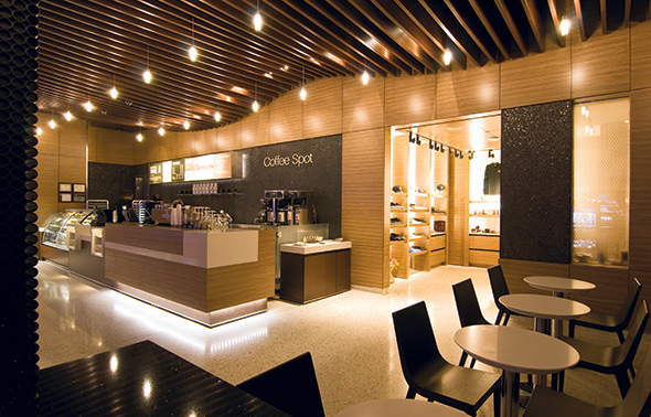
 The design of Coffee Spot, a nearly 24-hour-a-day kiosk operation inside a casino, centers around clean lines, efficient workflow, and durable materials and finishes. Image courtesy of DMAC Architecture P.C.
"If it's a walk-up operation, how do you get people to queue up, what do they see when they queue up, where do they wait and pick up their drinks, how do they access condiments and trash? These are all really important in any quick grab-and-go coffee setting," MacEwen says. "So are things behind the counter, such as proximity of the drip coffee to the register or service area. If it's two or three steps away instead of just a pivot and a turn, you dramatically impact efficiency and throughput during busy times, and you take away from the customer experience. Sometimes, too much space behind the counter isn't necessarily a good thing. It needs to be tight and very well organized."
MacEwen recommends a range from 36 to 42 inches between the front service counter and the back work counter. That distance keeps things within easy reach, he says, and allows space for employees to function during peak periods. It also controls sightlines so customers aren't seeing much of the floor between the counters.
Length of the production line is critical, too, MacEwen says, along with proper placement of dump sinks, hand sinks, reach-in refrigerators and ice makers. These items should remain within easy reach and not several steps away. Allowing ample counter space between the POS machine and the espresso machine creates a seamless, efficient flow from cashier to drink production to pickup.
"You have to think about how you'll staff the kiosk, particularly during peak periods," MacEwen adds. "Employees need to be able to work comfortably without stepping on or having to reach all over each other. The design should enable what's like a well-choreographed dance when it's busy. No matter the format, whether full-service shop or kiosk, it's really important to the brand to provide not just quality product but design that ensures a good experience for customers and staff alike."
To maximize usable space for storage, MacEwen recommends keeping the geometry of kiosks simple and straight. He specifically advises avoiding triangles and curves that can lead to dead space. Also, integrating front-of-the-house overhead shelving into the design can add important functionality in small kiosks where to-go cups and other supplies take up a lot of room. "In situations where there's very little back-of-the-house space, we'll try to 'aestheticize' storage and make it part of the design," he says.
The DMAC architecture team designed Coffee Spot, a grab-and-go operation near the entrance to Rivers Casino in Des Plaines, Ill. It features a built-in display merchandiser for food items. The rectangular kiosk spans approximately 500 square feet and operates nearly around the clock. It closes at 6:30 a.m. and re-opens at 9 a.m. Small tables toward the end of the kiosk provide both a landing area for customers waiting for their drinks and optional seating for those dining on-site. Standing-height counters along the sides of the space offer additional seating options.
"If you're designing a walk-up kiosk, it's important for customers to be able to wait comfortably and get out of the way of the line and the condiment station," MacEwen adds. "Think about and conduct plenty of walk-throughs of the entire customer journey to make sure you're avoiding any and all possible bottlenecks."
Oksana Fisenko, CEO and co-owner of Alex & Associates, a Troutman, Ore., coffee consultancy, and operator of the Barista Training School, agrees that successful kiosk design centers on organization and eliminating bottlenecks. Her firm helps start-ups in the specialty coffee business, providing expertise on everything from site selection and design to operations and business management.
Kiosks, says Fisenko, serve as a popular entry point for entrepreneurs because of the relatively low cost. But she cautions that the same fundamentals that dictate success in any full-scale restaurant endeavor apply to kiosks as well.
That starts with location. "Especially with drive-thru kiosks, operators need to think carefully about traffic patterns and accessibility," Fisenko says. "Quality product has to be a given, but beyond that, it's all about convenience. If customers can't very easily access and exit your drive-thru and/or if your wait times are long, it's a moot point."
Access to water lines represents another critical factor, Fisenko notes. "At a minimum, you need a water line and filtration. I've seen kiosk operations without access to a water line, but filling and emptying a water tank every day is really inefficient and gets old fast," she says. "And having to put a water line in is very expensive, so it's something that needs to be part of the site-selection criteria."
Alex & Associates recommends minimum sizing of 20 feet by 12 feet for a single-window operation at a drive-thru kiosk and 14 feet wide for a double-window operation. "That extra space allows you to fit a counter comfortably between the two windows and a 'two-group' espresso machine," Fisenko says. "You can't have it too small, and if you're offering food items, you need additional space. Permitting regulations for things like mop sinks, hand sinks and food storage can vary widely from municipality to municipality. Just as with larger coffee shops or restaurants, those will impact your design."
Case Study: Ziggi's Coffee Goes Small
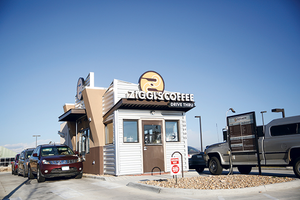
Eight-unit Ziggi's Coffee's franchise expansion effort now solely focuses on developing drive-thru kiosks. Measuring 400 to 500 square feet, the model features single- and double-sided drive-thrus, a walk-up window and, where possible, a small outdoor seating area — no inside seating. The Longmont, Colo.-based company's newest unit marks its first franchised location. It's a 492-square-foot double-drive-thru kiosk in Loveland, Colo. The company has nine additional kiosk units in development with agreements signed for more.
 Longmont, Colo.-based Ziggi’s Coffee’s drive-thru kiosks focus on speed and efficiency. Units like this one in Firestone, Colo., can move 60 to 70 cars through per hour. Image courtesy of Ziggi’s Coffee
The biggest challenge with kiosks is simply getting them built, says Ziggi's CEO Brandon Knudsen, who founded the company with his wife, Camrin, in 2004. "Planning departments and municipalities are very tough to work through," he notes. "Nowadays, you really don't find a location where there isn't some sort of HOA or architectural guidelines or all sorts of committees regulating development. They don't usually love the idea of kiosks, so there's some sales effort that has to go into showing them that there's value in this type of operation, that it's an asset that lets them use space in a parking lot, maybe, that wouldn't fit anything but this particular type of unit. Kiosks are 10 times harder to get open than cafes, but once they're open, they're more profitable and 10 times easier to manage."
Finding the sweet spot for the right kiosk size presents another challenge. Knudsen says slightly larger units have advantages in terms of capacity and curb appeal but disadvantages in terms of labor efficiencies. On the flip side, smaller units tend to reflect the ideal size, with layout and equipment set up so that a single employee can handle both drive-thru lanes and the walk-up window during slow periods, for instance.
Ideally situated on at least a half an acre for a double drive-thru, Ziggi's targets shopping center parking lots that otherwise sit empty. Trying to put a drive-thru in a spot that's too small and ultimately limits the amount of traffic that can access the lanes is a common mistake. Underestimating costs for water and sewer hookups, and utilities, is another mistake. In Colorado, for instance, simply getting the rights for water connection can run $50,000 before any construction begins.
"The building is actually the least expensive part of developing one of these," Knudsen says. "It's getting the water, sewer and electrical set up along with curb and gutter, etc., which is really important for a kiosk. Sometimes we don't even run gas in just to save money because we're so small and so efficient in there that we don't need the gas."
So far, all Ziggi's franchisees are buying the land for their operations, but Knudsen says the model is well suited for land leasing. "You can knock on doors and go into an Ace Hardware store, for example, and offer to pay a couple thousand a month for the empty part of the lot," he says. "We'll build the building, do all the work and just send them a check every month. It's a win-win."
Ziggi's newest design clusters the drive-up and walk-up windows toward the front of the building for greatest labor efficiency. The arrangement of equipment, supplies and ingredients within the kiosk allows employees to access what they need to fill an order without taking more than one step. And all ingredients sit in exactly the same location in every unit, making it easy for employees to work quickly and efficiently in any store.
Ultimately, for the kiosk model to work to its full potential, speed is the name of the game. Knudsen touts Ziggi's average of two and a half minutes from the time a customer places an order to the time they receive their drink as a key differentiator. That's roughly half the time he's tracked at major competitors' drive-thrus. "We'll run 60 to 70 cars through in an hour with no problem," he says.
Design and organization facilitate that speed, but so does technology. Each Ziggi's unit features a large kitchen display screen visible to all employees, showing pending drink and food orders, with all necessary modifications, as well as drive-thru times. A label printer produces easy-to-read order stickers for the cups, which help eliminate miscommunication.
The company also offers a mobile ordering app. Utilizing voice-recognition technology, it lets customers place and pay for orders ahead of time, so their drinks are ready for pickup when they arrive.
And while full-service Ziggi's cafes (the company has four in Colorado) use high-end traditional espresso machines, its kiosks tap state-of-the-art, high-capacity automatic machines that help ensure speed and consistency. Each unit also relies on a large dual-brewing unit for drip coffee and multiple high-end blenders.
"You can't skimp on blenders," Knudsen notes. "Consistency of ice and blended drinks is everything. Your ice machine is also critical. If you have an ice machine that's turning out really dense or inconsistent ice, regardless of your blender, it's going to blend inconsistently. Those are all things we take very seriously in terms of our equipment package." FE&S


