Staff service stations can become a bit of a no-man’s-land. Many interior designers aren’t well versed in service stations’ full operational implications — or keen to take away from other design components to accommodate them. And in many cases, foodservice consultants are not asked to weigh in on decisions made on the other side of the kitchen door.
But woe betide the operator who gets this mission-critical area wrong. Failure to pay sufficient attention to server stations, and to design them with both function and form in mind, can have serious negative consequences for guest experience and staff morale.
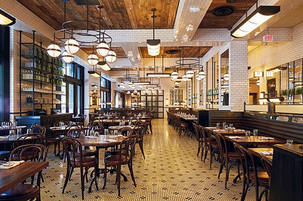
 Front-of-the-house staff at The Smith, an American brasserie in Washington, D.C., access POS machines and supplies at stations designed as a feature in the main dining room. Photo by Clarence Butts
“It can be pretty tough to get inexperienced operators to focus sufficiently on these areas and to allot ample space for them,” says Dave Shove-Brown, partner at //3877, a Washington, D.C., architecture, design and brand development firm. “That’s rarely the case with experienced operators. They recognize the importance of getting it right, likely because they’ve paid the price for not doing so in the past. It’s not something you want to have to go back and redo because you didn’t think carefully enough about it up front.”
Analyze Products, Paths, Processes
As with other areas of restaurant design, server station design should begin with careful consideration of menus (both food and beverage) and intended service style, Shove-Brown says. Other critical issues that require up-front analyses include flow and circulation. Not unlike what takes place in professional kitchens, where consultants apply industrial engineering-style methods to determine space needs, create efficient work stations and enable seamless flow, server stations call for detailed scrutiny of products, paths and processes.
 Rather than try to hide or mask service stations, design firm //3877 opts to integrate them into the overall front-of-the-house design, creating functional spaces that also enhance aesthetics. Photo by Gabriele Stabile
“The first question is really trying to understand how the restaurant or foodservice operation should function on a macro level,” Shove-Brown says. “How does the kitchen operate? What’s the flow? Do you have food runners, or are the servers running the food? What about bussers? Is that a separate function, or do servers handle that too? What’s the circulation like, and where are people stopping or intersecting? What kind of POS system will the operation use? How about water and other nonalcoholic beverage service? All of that plays into how server stations need to be positioned and built to support each function as efficiently and seamlessly as possible and do so without detracting from the guest experience.”
Shove-Brown also suggests that, at operations gearing up for expansion, management spend some time analyzing sales trends to help determine the type, configuration and capacity of server stations for future units. “The old tendency might have been to have, say, a point-of-sale station or two, soda, coffee and tea, ice, and it just kept growing from there,” he says. “Instead of just following that ‘how-we’ve-always-done-it’ template, we try to get clients to focus hard on what they’re selling and observing how the service stations are actually being used. Do they really sell enough tea to justify the amount of space or equipment they’ve dedicated to tea service? Can a small station in the kitchen handle that instead?”
Getting operations involved early in the design phase leads to better decisions, adds Andy Simpson, a former chain restaurant design and development executive who now heads up Andy Simpson Design in Austin, Texas.
“You may have always put a beverage station here or there, but is that really the best path of travel for the waitstaff?” Simpson says. “Stations like that can often be better put in the kitchen than out on the service floor, but in order to figure that out you have to bridge the gap so that the service folks and the design folks are talking to each other. The designers should know things like how many servers and support staff will be on the floor per shift, who will do what, how many tables each server will be responsible for, what the sections will be and exactly what items need to be readily available to them in order to provide good service without spending half of their shift running back and forth to get things.”
Avoiding lines and keeping servers on the floor taking care of guests becomes the bottom-line goal, Simpson says. His guiding principle: Any time servers have to travel too far or stand in a line to access what they need or perform a task — whether it’s settling a check, grabbing a replacement fork, or refilling a soda — also leaves customers waiting.
Divide and Conquer
Another important trick of the trade for service stations: maintaining focus. Building too many functions into a single station leads to inefficiency, clutter and staff frustration, says James Geier, principal at 555 International, a Chicago-based design, development and fabrication firm. Geier, who owned and operated restaurants before launching his design-build business, suggests adopting a “divide and conquer” mentality.
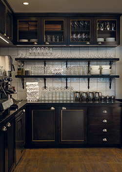
 At Gemini in Chicago, a service station in one corner of the dining room is an important part of the designed environment. Resembling a residential kitchen, it is fitted with custom upper and lower cabinetry and open shelves. Photo by Eric Kleinberg for 555 International“A lot of questions need to be addressed early on during planning and programming, and a lot depends on the concept and the real estate you have to work with, but we generally design to ensure that service staff members don’t interact unless they’re supposed to. Bussers, runners and servers shouldn’t have to intersect. They need to be able to move seamlessly throughout the space and have dedicated stations properly located so that they’re not causing problems with access or traffic flow. We have service stations that might purely be bussing stations designed for on-floor needs — water, place settings, tabletop items, transfer areas where dirty dishes and glasses can be held for short periods out of guests’ view before going back to the kitchen.”
Likewise, Geier says, dedicated stations for waitstaff ensure easy access for them to quickly place orders and complete transactions without having bussers or runners reaching over or around them to reach a silverware drawer or a shelf for salt and pepper shakers. Ideally, those are front-of-the-house stations and strategically located close to clusters of tables.
“You don’t want servers having to run back into the kitchen all the time. You want them on the floor taking care of guests. You need to design your stations in such a way to keep the waitstaff out in front and moving,” Geier says. “If you put in too few terminals or have only one order-input station when the volume and size of your operation justify multiple stations, you’ll end up with frustrated servers standing two and three deep waiting for their turn at the POS machine. And guess who else will be frustrated and waiting? Your guests.”
 In short, think about service station design from the perspective of the servers, bussers and runners who will use them. That, Geier says, means keeping divide and conquer in mind. “Your servers will thank you, and you’ll be setting them up to provide better guest service by giving everyone a properly designed, easily accessible space.”
Shove-Brown also embraces that approach, adding that it all stems from the central premise of having everything in place and designed to enhance the guest experience. Forcing multiple staff functions into a single area, he says, is a “recipe for disaster.”
“We see it all the time where owners will say they plan to have a service station at the bar right by the drink pickup area. Well, OK, but that means you now have three different people colliding in the same space for three totally different functions,” Shove-Brown says. “Or they’ll say they want a service station right inside the kitchen, but they fail to realize that it’s right in the flow of traffic. It’s fine to have a service station in the kitchen, but its location needs to be appropriate, and whatever needs to happen at that station shouldn’t impact other employees and other functions.”
Failure to fully think through exactly what each station needs is yet another common misstep, Shove-Brown notes.
“It always confuses me when operators or designers create stations that have shelves for plates and glasses, for instance, but no drawers for extra utensils,” Shove-Brown says. “Now, the server has to go to a different location and schlep back and forth. The whole intent of these stations is to have everything needed to assist the server, to make their life easier and enable them to provide great service. Instead of running around the restaurant getting their 10,000 steps in, they’re right there saying let me refill your drink or grab you an extra fork or run your card through and get you on your way.”
Aesthetics Matter
While primarily intended to provide functionality that front-of-the-house staff need to perform well in a location that is as close to the point of service as possible, service stations also require design finesse. As they’re typically in full or partial view (and smell and earshot) of guests, they need to look good, be well organized and fit the brand.
The key, says Shove-Brown, is to embrace the opportunity to design service stations so they enhance rather than detract from the guest experience. “Guests are going to see them, so it’s worth the time and money to use nice finishes and materials and to make them an integral part of the design,” he says. “You don’t have to hide them or mask them, but make them fit in.”
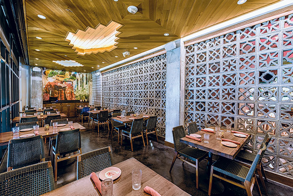
 Employing a strategy of “hiding in plain sight,” a service station in the second-floor dining room at Mi Vida Restaurante in Washington, D.C., becomes part of a feature wall. Photo by Rey Lopez, Under a Bushel Photography
Simpson agrees, noting that, while in the past operators took pains to hide service stations from view, that’s not as much the case anymore. As with open kitchens, bringing server functions into view can add energy and transparency to the dining experience. The trick, he says, is to deliver on that while maintaining pleasing aesthetics and acoustics.
“You can take almost a residential approach,” Simpson says. “Residential-style furnishings work really well for service stations. Maybe you have a beautiful table in the dining room with a water pitcher on top and a basket with silverware in full view versus hiding those things around a corner where they take up space and don’t contribute to the atmosphere. Or maybe it’s a marble-topped cabinet used as a bread station or a low cabinet that can be used as a dividing wall or that a touchscreen POS screen can be recessed into.”
From an aesthetics standpoint, Simpson suggests looking at server stations through the eyes of guests. “Imagine yourself sitting next to it or across from it and ask yourself if it would bother you to look it at or take in what’s going on there as part of your experience. That includes thinking carefully about not just what’s in view, but also what guests can hear and smell if they’re seated near a service station or passing one. All of those things have to be part of the discussion, and the earlier they’re considered in the design process, the better.”


