The burger, shakes and fries chain is applying a new look and kitchen design across multiple operational styles.
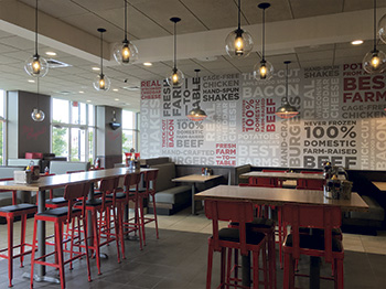 For dine-in operations, the chain has reduced booth seating in favor of community tables and two- and four-tops.It’s been a busy few years at Johnny Rockets headquarters.
For decades this burgers, shakes and fries chain focused on providing a classic Americana experience: a 1950s-style diner with Norman Rockwell art, lunch counter and booth seating, waiters in all-white uniforms, and classic rock-n-roll playing on the jukebox.
More recently, though, the chain has shifted away from that experience as the heart of Johnny Rockets. It has opened locations in universities, express stores in malls and, just a few weeks ago, its first restaurant with a drive-thru. It’s even developing a kiosk prototype that would sell only shakes and fries.
According to James Walker, Johnny Rockets’ president of operations and development, creating these different operational prototypes allows the chain to reach customers in more places by making it easier to open new stores. “From a business-to-business standpoint, really it’s providing investors and franchisees with the best option given the available real estate. You bring us the site, we’ll bring you the prototype that best exploits that site from a business standpoint,” says Walker.
Up until a few months ago, these prototypes all had Johnny Rockets’ traditional classic Americana look. With the change in customer experience, though, the time for an overall brand refresh had come as well.
This refresh, dubbed Diner 2.0, has three main pillars: elevated customer touch points, such as flatware and china; a redesigned front of the house with a warmer, more modern appearance; and a kitchen built for speed and consistency.
Front of the House
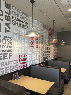 Johnny Rockets’ “freshness cues” mural drives home key messages.As with any redesign to the front of the house, the Johnny Rockets design team had to walk a tightrope: develop an appearance that would bring in new diners — in this case, millennials — without alienating the chain’s loyal customer base. For Johnny Rockets, the degree of difficulty was higher than normal, since so much of its appeal has been linked to the nostalgic experience it has provided.
The design pulls off this balancing act by mixing modern elements with some traditional Johnny Rockets colors and features. While the exact Johnny Rockets layout changes based on a location’s operational style, under the Diner 2.0 model locations have many common elements. And designers can apply many of these features by simply resizing or moving elements. “Really, Diner 2.0 can be draped over any number of these prototypes,” says Walker.
The chain’s color palette, for instance, has shifted from bright red and white to more relaxing, welcoming tones, including grays and wood tones. Splashes of bright red can also be found throughout the operation, connecting the new look to the company’s history. Walls are painted gray, while the dining area’s floor now features oversized gray rectangular tile.
Upholstered booths, also in gray, serve as another connection to Johnny Rockets’ previous design, which relied heavily on booth seating. As part of Diner 2.0, though, booth seating has been reduced. In its place, the chain now uses red chairs and standard two- and four-tops as well as high-top community tables with real wood tops.
Another important element helps the new design stay connected to Johnny Rockets’ roots. Historically, Johnny Rockets has been known for offering counter service. In new stores, counter seating has been incorporated into the design whenever possible, including in college, mall, drive-thru and table-service prototypes. “We changed the color of the counter stools and made it a solid-surface top. Whether it’s a traditional sit-down or large enough counter for a ‘pay first and find your own seat,’ we still incorporate a lunch counter whenever possible,” says Dominic Talavera, the chain’s vice president of development.
The new design also has a new lighting package that utilizes pendant fixtures and LED bulbs. Notably, the chain uses lighting to distinguish among the different seating areas, with counter seating, booths and community tables all getting their own fixtures.
The stores also have some signature design elements that can be easily ported from one operational style to another. One of these is a “freshness cues” mural made of a vinyl wall covering. This mural has a light gray background and emphasizes the quality of the chain’s food through phrases in gray, red and white text, such as “cage-free chickens,” “fresh farm-to-table,” and “hand-spun shakes.”
Another major decor piece is the mural wall which shows a photograph of a chef assembling a burger. Instead of being painted on, this mural is a heat-applied graphic that the chain bonds to a brick wall using a hair dryer. “There’s different iterations of it,” Talavera says. “There’s a full chef, and he’s creating a craft burger . . . Depending on the wall surface, sometimes we crop the photo down, and we’ve basically got the chef’s hands, targeting on the craft burger. It really stands out on the brick.”
Inline with this emphasis on quality, the new design also features upgraded customer touch points, including china, silverware, glassware, napkins, salt and pepper shakers and even ketchup packets and to-go containers. All of these contribute to an overall better customer experience, Walker says. “You’d rather have a heavy knife and fork than a cheap stamped piece of metal. We want everything to be just a little bit nicer.”
High-Efficiency Kitchen
Supporting this new front of the house, and the new, operational prototypes and their different demands is Johnny Rockets’ “high-efficiency kitchen.” The kitchen redesign, says Talavera, began about two years ago and ties directly to the new prototypes and service styles the company has developed in recent years, specifically the drive-thru concept.
When Walker first proposed the idea of a drive-thru restaurant, it fell to Talavera to develop a kitchen for it. “If people are going through a drive-thru, you’re not going to cook [made to order] on a traditional griddle, and people aren’t going to wait 8 to 10 minutes to get their lunch,” says Talavera. “So we started testing a clamshell grill in a test kitchen environment. That’s when the lights went on. ‘Hey, why couldn’t we put this in all our restaurants? Why can’t we make all our kitchens high efficiency?’”
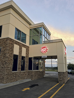 Once focused solely on providing an Americana diner experience, Johnny Rockets has recently developed drive-thru, college and mall prototypes.Today, he says, the high-efficiency kitchen represents the standard for corporate-owned stores and the preferred model for most franchisees. It applies to every style prototype, with slight adjustments made for footprint and operational needs.
The high-efficiency kitchen’s production line starts with the previously mentioned clamshell grill, which replaced a standard flattop. It is the lynchpin of the new design. The 42-inch wide unit has three 12-inch platens. Each section of the unit (grill and platen together) has its own set of cooking controls. A single section is capable of cooking eight burgers at a time, with a cooking time of just one minute.
Following the clamshell grill is the dump station, which represents another change to the chain’s specifications. Previously, Johnny Rockets’ dump station relied on heat lamps to keep food warm. This new station eliminates the heat lamps in favor of an air curtain-based unit, which improves product quality, says Talavera. “They keep the moisture and the heat of the product inside there while we’re getting everything prepped, so it’s not drying anything out.”
The dump station sits on top of a 48-inch, 4-drawer refrigerated unit, which holds raw proteins that staff cook on the clamshell grill. Talavera notes that the sizes of these 2 pieces (48 inches and 42 inches) align nicely with the concept’s 96-inch legacy chef base, which makes retrofits to existing kitchens easy.
The hot line ends with a set of high-end fryers, also new to Johnny Rockets’ kitchen. The bank consists of two to three units with two baskets each. The programmable, highly automated fryers feature basket lifts for when product finishes cooking. They also have a self-filtering function and oil reservoirs that automatically add shortening to the pot when necessary. This feature is set to work automatically based on probe readings of oil quality but can be delayed during peak hours with the push of a button.
While the fry bank marks the end of the hot line, kitchen staff can turn 180 degrees to reach the island make station. In traditional Johnny Rockets stores, Talavera says, this station consisted of mostly custom pieces with an overshelf that held dishes, flatware and disposables. The high-efficiency kitchen takes a modular approach, using standard equipment, which lowers costs and makes cleaning, repairs and replacements easier.
A refrigerated worktable with wells on top for holding lettuce, cheeses and other sandwich toppings serves as the make station’s primary piece of equipment. One of the few differences in the prototype for the different operational styles (express, drive-thru, etc.) involves this table, notes Talavera. In drive-thru units, this table has work space on each side, allowing two kitchen staffers to assemble orders at once, making it easier to meet the speed expectations of customers waiting in their cars.
The island make station also includes a new addition to the Johnny Rockets’ kitchen: a vertical toaster used to caramelize buns. In the previous design, buns were caramelized on the grill next to the burgers. That simply wasn’t an option in the new kitchen, given how — and how quickly — the clamshell cooks.
“With that speed, we found that we now have to worry about how to build [a burger] fast enough,” Talavera says. “That’s where the vertical toaster comes in. You roll [the buns] on butter, drop them in this toaster, and out they pop at the bottom while you’re getting patties ready on the griddle.”
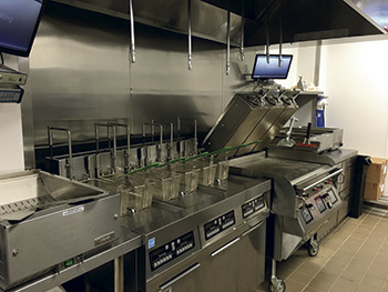 The chain’s new high-efficiency kitchens make use of a clamshell grill, which can cook a batch of burgers in just one minute.This line also holds a new soft-serve ice cream machine, which replaced a cabinet used to hold hand-dipped ice cream. This piece cuts the time to make shakes nearly in half. Talavera says, however, that some franchisees are sticking with hand-dipped in order to offer more authentic sundaes and floats.
The final major change to the Johnny Rockets kitchen is the move from a paper ticketing system to kitchen display monitors, which split tickets and send them to their appropriate station: grill, fry or expediting.
These changes all combine to dramatically improve the chain’s speed of service. In the old kitchen, ticket times were between six and a half and seven minutes. In the new stores, ticket times are less than four minutes — and less than three minutes for drive-thrus.
Serving food quickly is only one benefit of this new kitchen, Walker stresses. “It’s also quality and consistency. This allows us to provide the highest quality and consistency possible as well as faster speed of service. It creates a more efficient kitchen and a better guest experience.”
That better guest experience, says Walker, is really what the entire Diner 2.0 project is about. By creating a better kitchen, modernizing the appearance, and elevating the customer touch points, the chain that was founded on nostalgia is now much more forward looking. Combine that with the multiple prototypes Johnny Rockets has developed, and the concept seems primed for growth.
Walker explains, “We thought it made sense after 30 years to restate what we’re all about, the quality of the brand, of the experience, and to make sure we had a decor package and an experience that really appealed to a broad section of the population. That’s what we’ve done.”
Facts of Note
- Headquarters: Lake Forest, Calif.
- Year founded: 1986
- Signature menu items: Burgers, shakes, fries, chicken tenders
- Number of units: More than 350
- Unit size (New drive-thru style): 2,800 sq. ft. (1,300 sq. ft. FOH; 1,500 sq. ft. BOH)
- Seats per unit (drive-thru): 60
- Location types: Multiple operational styles, including freestanding with table service, mall, college/university and drive-thru
Key Players
- CEO: Charles Bruce
- President, Global Operations and Development:
James Walker - CMO: Joel Bulger
- Senior Vice President of Domestic Operations: Jim Hicks
- Interior Designer: Conceptual design by WD Partners; Final design by JR Development/Design Team
- Kitchen Design Consultant: Albert Yanez with Clay Enterprises
- Equipment Dealers: C&T Design and Equipment, Concept Services, Myers Restaurant Supply

