A thorough overhaul of a 40-year-old cafeteria brings a welcome change to a marketplace-style dining environment serving 3,000 customers a day and putting equipment on display in an open, fresh setting.
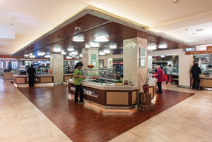
 The salad bar is one of two island stations in Café 601. Lighting under the front counters produces an impression that the island is floating. For many years the main retail service location in Strong Memorial Hospital, which is part of the University of Rochester Medical Center (UMRC), served a continuously growing population. Originally built in 1975, after years of service the cafeteria was in dire need of upgrading and modernization to improve the overall customer experience.
"Over these years, the overall population in the medical center went from 2,500 employees to more than 10,000," says Al Caldiero, director of food and nutrition. "The biggest problem to solve was finding a way to improve customer flow and design a retail serving area that would allow us to offer a wide enough selection of foods to meet the needs of an international population. We wanted to provide high-quality foods that are fresh and flavorful, as well as offer education, support and guidance for healthy eating."
When the renovation project was first considered, Caldiero and other hospital administrators wanted to expand the servery to 7,500 square feet from 5,000 square feet. But the expansion idea was rejected by the hospital's senior leadership. "Despite that disappointment, I knew we still wanted an open kitchen with cooking on display and staff interaction with customers," Caldiero says.
Determining what customers would like in a new dining environment was part of a comprehensive operational and feasibility study conducted by Georgie Shockey, principal, Ruck-Shockey Associates Inc. The study was conducted five years before construction began. Initial concept/development design began in 2008. Funding approval was given in 2011, and construction began in February 2012 to prepare the north end of the dining room to serve as the temporary cafeteria during construction. The cafeteria was shut down from April 2012 until November 2012, when Café 601 opened. The name, Café 601 at Strong, a reference to the hospital's post office address, was submitted by a URMC staffer in an all-hospital competition.
"Though there was a long gap from start to finish, it was well worth the wait." Caldiero says. Customers entering the café find a palette of natural colors such as celery green, cream, brown and butternut orange, which produce a marketplace ambiance and emphasize the cafeteria's commitment to serving fresher, healthier fare. A 25-foot-wide glass-paneled entrance, with signage that can be seen from the main elevator bank down the hall, helps visitors find their way to the servery. Glowing spotlights, granite-like counters, cherry-toned wooden floors, designer tiled finishes and serving islands for food stations combine to present an upscale environment.
"Even though we didn't expand the square footage, the space feels significantly larger thanks to the layout and removal of walls to create peer-through kitchen areas that allow customers to watch their food being prepared," Caldiero says. "Previously we had three stations and a salad bar, and long lines were a problem. Today the café contains six stations and two self-service bars in the middle of the space. Now, with the free-flow design, customers disperse among all the stations so queues and waiting times are controlled."
"After just 2 months of operation – we are experiencing about 20 percent increase in total sales and an increase of about 10 percent in our average check," Caldiero continues. "We didn't raise prices, and to encourage healthful purchases, we keep healthier items at a lower cost than less healthy items. Staffing levels remain the same."
In order to give the impression of a larger space, the architects got creative. For example they raised the ceiling and opened up the doorway. "The old doorway contained a pair of 40-inch-wide doors," Caldiero says. "An entire wall was blown out, and a 24-foot collapsible glass door was installed, providing customers with an impressive view of the entire open space as they walk in."
Designers faced myriad layout and operational challenges when transforming the space. For example, the north end of the dining room had to be dedicated throughout the entire project for temporary service while the rest of the space was under construction.
"Sales only dipped about 15 percent throughout construction," Caldiero says. "The ability to construct
the entire space in one phase saved considerable time and dollars."


