With a new design, this fast-casual operation ups the emphasis on dine-in service and food quality through an open kitchen.
Walk into one of Zoës Kitchen’s older stores and you’ll find an energetic cafe-style fast-casual restaurant. It’s the type of place that’s good for slowing down for a few minutes and enjoying your lunch. Walls covered with soothing green, orange and red stripes, polymer chairs in the same colors, some wood-toned paneling, tiled floors and ceiling, a few upholstered booths. It’s not a bad experience at all.
The problem is that Zoës isn’t really a cafe. It’s a Mediterranean concept serving hummus and baked feta; kabo bs and pitas; and entrees featuring ingredients liketabbouli, tzatziki and fresh sliced cucumbers.
“A lot of people would come into our previously designed stores and they didn’t really make a connection of our brand identity and our menu to the interior design,” says Archie Andrews, Zoës vice president of design and construction. “You really didn’t feel like you were dining in aMediterranean environment.”
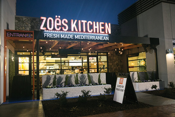
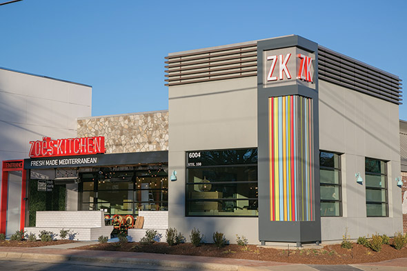
With that in mind, the chain’s new prototype in Raleigh, N.C., drives home Zoës’ Mediterranean roots. More than that, though, with a redesigned interior and well-thought-out display kitchen, it creates a customer experience intended to attract dine-in guests for both lunch and dinner.
Going for Dine-In
Zoës isn’t committing to dine-in to the exclusion of other business. This new restaurant has a separate entrance for carry out customers and a grab-and-go display cooler, for instance.
But in some important ways, this new prototype goes against the trend in the fast-casual sector. Many concepts have reengineered their business models and restaurants for off-premise business, going so far as to scale back on the interior design spend and seat count in anticipation of fewer dine-in guests.
That isn’t Zoës’ philosophy. Instead, the chain viewed the redesign as a way to better serve its dine-in customers, and even increase dine-in traffic count with a more complete dining experience. Offering this experience means Zoës had to continue a years-long shift in its appearance and its business, Andrews notes. “We were really created years ago with more of a lunch daypart. Through the years, we tried to balance that with our dinner business. As we’ve grown, we’ve always tried to use our design to grow that dinner business [and] add those dinner cues.”
Dinner Design
Perhaps the restaurant’s biggest dinner cues lie in its seating. Instead of just having polymer chairs and basic tables, Zoës now offers several different seating options. These include custom-made booths with bench-style seating, high-top tables, round four-tops and upholstered round booths. With the different materials, creative lighting, and different locations in the dining area, the restaurant creates “pockets of energy” that allow guests to have the type of dining experience they want.
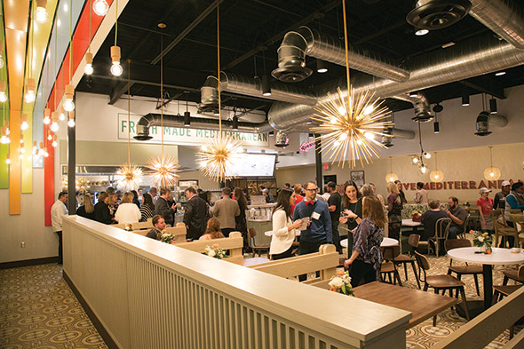 Encaustic floor tiles communicate the restaurant’s Mediterranean menu, while various seating options create different “pockets of energy” for guests after different experiences.
One of these pockets of energy resides outside — Zoës patio. “I think in a lot of restaurants, the patio is an afterthought,” says Andrews. “A lot of thought went into our patio.”
To maximize periods when the restaurant can use this space, for instance, Zoës’ new patio features a cover that provides shade in the warmer months and some protection for the elements during colder periods. The patio also includes warmers and misting fans to make the area even more comfortable.
Beyond temperature control, thoughtful design enhances the patio’s appearance and ambiance. It has a large planter box in front and a boxwood wall. These elements bring some life and vibrancy to the space, and they also serve as good backgrounds for guest selfies (and hopefully some low-key social media marketing with Instagram, Twitter and other platforms).
The patio also has design elements inspired by photos of homes built into the cliffs of Mediterranean islands, Andrews says. The space features white epoxy tables and white bench seating (representing the land and houses) on an ocean-blue floor that “gives you a sense of the Mediterranean landscape and seascape,” he says.
The Mediterranean atmosphere continues with a large mural on the building’s exterior that showcases the Mediterranean Sea and the region’s 20-plus countries. “That mural shows our inspiration, the countries of the Mediterranean we draw from,” Andrew says.
The interior, of course, also has Mediterranean elements that drive home the restaurant’s theme. The most obvious of these is the flooring, an encaustic tile with a pattern similar to what can be found in many Mediterranean countries. The company also uses colors reminiscent of the Mediterranean on the interior, including a striped element on the ceiling of the ordering line with colors that match the food, such as an olive green and a tomato red.
Form, Function and Throughput
The thoughtfulness of Zoës interior design extends into the new open kitchen, as well.
The chain, says Andrews, has long performed a great deal of prep work in house, including cutting its own fruits and vegetables; making hummus, bean dishes, rice dishes and other sides from scratch; and grilling its proteins fresh. But all this was hidden behind a wall, keeping guests in the dark about the freshness and quality of the food. Putting it on display gives the chain the credit it has long deserved.
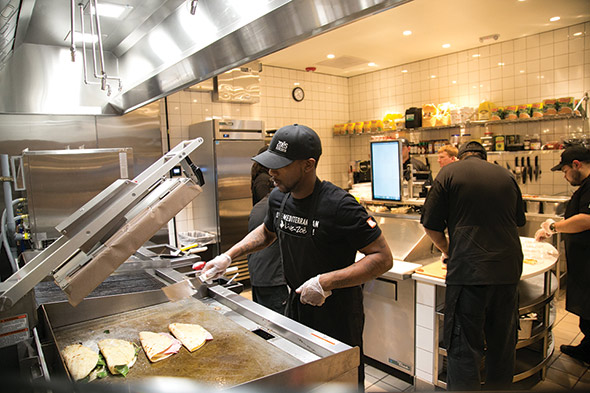 Zoës uses a flattop grill with a clamshell arm to make hot sandwiches and wraps.
This thinking, while completely logical, is not unusual. Most restaurants with display kitchens want customers to see how much effort goes into the food they make.
Zoës, though, takes the idea of display further than most, incorporating some high-end design elements into the space. In addition to tiled walls instead of fiberglass reinforced plastic, the kitchen features a drywall ceiling (not tiles), a chandelier, and an island workstation with a granite countertop.
“There really has never been a lot of form in our kitchen, there’s just been a lot of functional throughput, so we started to incorporate design. You’ve got to dress it up if you’re going to show it off,” Andrews says.
Adding form, of course, doesn’t mean the new kitchen lacks function. In fact, according to Director of Construction Stephen Hall, improving flow and throughput was one of the key goals of the kitchen redesign.
In the previous kitchen, says Hall, team members would walk from station to station assembling an order. The new flow more closely resembles an assembly line. Staff pass dishes down the line adding food and upon completing the order, a member of the culinary team places it in the pass-through window.
This journey actually starts each morning, when proteins and produce travel from Zoës’ walk-in cooler to the kitchen’s granite-topped work surface. There, staff prep items before distributing them to the production stations, which form an L shape.
Each morning’s prep takes several hours, with team members relying on countertop equipment to make items such as hummus and hand-cutting other items like tomatoes and lettuce.
Staff wash vegetables in sinks along the kitchen’s back wall, the former home of the kitchen’s hot line. The new kitchen design places that line at the very front of the kitchen, giving customers a clear view of the cooking processes.
The hot line starts with two ovens, one on top of the other. With the previous equipment package, both were convection ovens. The updated equipment package replaces one of those ovens with a combi.
Zoës added the combi because of its flexibility, according to Andrews. In fact, the chain already established processes for using the combi to bake desserts, roast vegetables and especially cook or parcook meats. “It allows us to batch cook a number of proteins for catering orders. If we need to, we can also parcook chicken breast as we prepare for a large lunch rush. The combi oven gives us that flexibility that we didn’t have in the convection oven. It allows us to bake the chicken but contain the moisture in the product. We can then finish it off on the grill.”
To the left of the combi sits a four-burner range that cooks soups, rice and beans. Then comes a two-foot gas-fired flattop, which cooks chicken to order. Next is a two-foot chargrill for salmon steaks and shrimp kabobs.
A three-foot flattop secures the end spot on the hotline. The flattop breaks down as follows: two feet for grilling vegetables and potatoes, and one foot that cooks hot sandwiches and wraps via a clamshell arm attachment.
To assemble these items, the team member turns 180 degrees to a sandwich table that sits in a cutout in the island prep station. Other prepped ingredients, including proteins and vegetables, are held in a seven-foot lowboy beneath the hot side equipment.
Following this flattop is the plating station for hot items and hot sides. Located at the turn in the kitchen’s L, it sits at a slight angle, with the team member facing guests in theordering line. Protected by a food shield instead of a full-height glass wall like the hot equipment, “it really gives the customer the opportunity to almost step inside the kitchen, take a look at what’s going on and engage with folks as they’re plating other people’s food. It gives you an idea of what side you might want as you look in,” says Wall.
In addition to the aesthetics and customer experience of the plating station, a lot of thought went into its equipment. The plating station comprises two, 2-foot by 2-foot conduction warming tables.
These conduction units warm all the table surfaces.Compared to the defined heating zones of induction tops, this gives Zoës the flexibility to add new hot sides simply by shifting some pans, says Wall. While a steam table would have been flexible, too, the presentation simply isn’t as nice as a good set of pots and pans. Finally, by having two identical units, Zoës ha s built in redundancy should one table malfunction.
The cold line follows the plating station. This includes two refrigerated work tables with drop-in wells. Staff use one of the tables to assemble salads and the other for cold sandwiches, as well as cold sides like hummus. This section also houses a food warming cabinet for holding backups of hot sides. On top of this is a cheese melter used for toasting pita bread. Once assembled and plated, all items are placed on a pass-through window on the restaurant’s cold side.
Growth Through Value
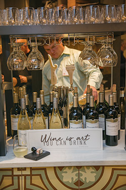 Zoës is hoping a new tap wine system with an attractive glass display will help drive beverage sales.After rolling out a new prototype, companies commonly tweak the design and/or kitchen layout after a few months of operation. With the new Zoës prototype only open a few weeks, the chain hasn’t had enough operational experience to know what it needs to change, Hall says.
Early results for the store are positive, though. While staff adjust to the new store, the location hasn’t pushed catering sales. Sales, though, remain solid even without this revenue stream.
The dine-in/off-premise split has also been encouraging, with about 60 percent of guests enjoying their food at the restaurant vs. 50 percent system-wide. The chain remains cautiously optimistic this reflects the quality of the new design and improved customer experience.
“We’re going to watch that trend and see where it goes,” Hall says. “I think there’s an opportunity as the weather gets better for people to take advantage of the patio. That’s a little bit tough to do right now. That might give us an uptick on the dine-in and potentially even the beverage platform.”
Looking ahead, the company plans to open 25 to 28 new stores in 2018. That’s actually down from 38 last year. The lower number of new stores, Hall says, will let Zoës remodel around a dozen older restaurants due for a refresh. These locations will be given a similar look and feel in the dining room, though the kitchen won’t change to keep remodel costs low.
What’s more, the chain will likely stay in its existing markets as it expands, with a focus on larger metropolitan areas in the Southeast, as far west as Arizona and into Kansas.
No matter the number and locations of stores it opens this year, all will be company owned. Zoës has only one franchisee in the system, and that partner is not expanding. While most concepts with 250 locations have long franchised, Zoës prefers to control its stores and the experience it offers its customers, Hall says.
With this new design, Zoës once again proves how much it cares about the guest experience the chain provides. During a time when many others continue to de-emphasize the dine-in environment, Zoës feels that providing a better experience will help get diners not only in the door, but sitting down and enjoying their food.
“In this environment, customers are going to perceive a better value, even though the food is going to be the same and the price is going to be the same. Our feeling is they’ll enjoy their experience better. So far, we’ve gotten that feedback.”
Zoës Kitchen at a Glance
- Key Players: Kevin Miles, CEO and president; Antonio Locchi, vice president of culinary and beverage strategy and innovation; Archie Andrews, vice president of design and construction; Allyn Taylor, chief development officer
- Kitchen Design: In-house
- Interior Design: Conceptual work performed by Plan B
- Equipment Dealers: TriMark Strategic, Johnson-Lancaster
Facts of Note
- Chain Headquarters: Plano, Texas
- Year Founded: 1995
- Signature Menu Items: Hummus and pita; Kabobs with Mediterranean sauces; Mediterranean bowls
- Number of Units: Approximately 250
- Unit Size (prototype): 2600 square feet (1,000 BOH; 1,600 FOH)
- Location Type: Inline, end-cap and standalone
- Number of Seats (prototype): 60-65 inside, 25-30 exterior patio

