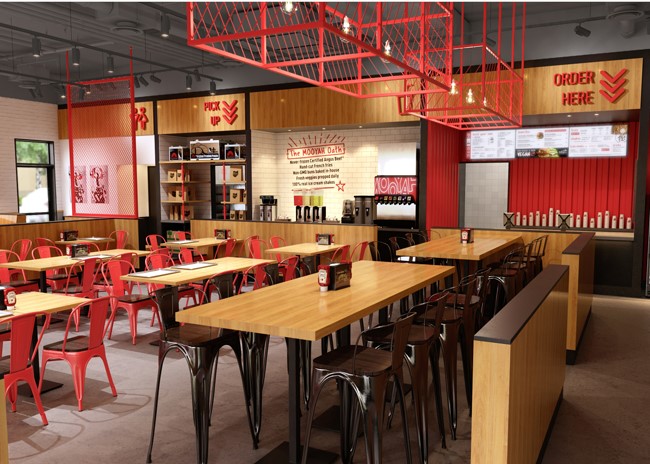
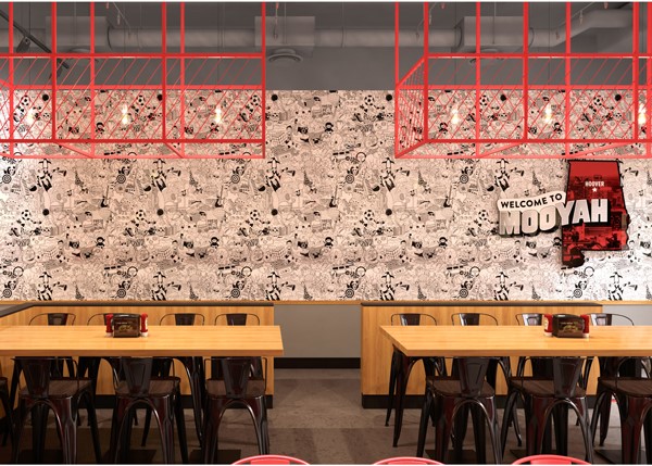
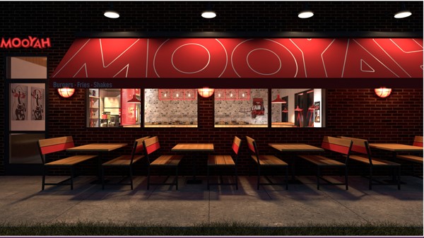
Next year, MOOYAH Burgers, Fries & Shakes will get its first major facelift since the fast-casual chain’s inception in 2007. The brand refresh, which includes new seating, technology and a redesigned logo, is intended to position the company for growth in the face of changing consumer demands and expectations.
 Scheduled to open in February, new MOOYAH locations in Hoover, Ala., and Orlando, Fla., will be the first restaurants to feature the new design. Footprint of the prototype is 2,400 square feet. MOOYAH hopes to remodel all existing units by the end of 2024.
“This new design and layout will take MOOYAH to the next level in terms of providing a differentiated experience that reduces friction for our guests and team members,” said Tony Darden, the restaurant chain’s president and chief operating officer. “This new approach will also align with our overall strategy to be accessible to our guests in the manner in which they want to enjoy their dining.”
The impetus for the renovation project, according to Natalie Anderson Liu, MOOYAH’s vice president of brand, was a realization that the chain was in danger of falling behind in the ever-present race for share of stomach. “We agreed that our design was not going to position us well for the future and didn’t meet the growing consumer need for third-party delivery. From an aesthetic standpoint, we felt that our food was superior to our competitors, but they were getting all the consumer buzz because they have sexy environments. So, enhancing our design would put us one-up on other brands.”

Livit, a Madrid-based design firm, worked with MOOYAH on its brand analysis and redesign, creating the eventual prototype for the new restaurants. Livit has also worked on design for Applebee’s, TGI Friday’s, California Pizza Kitchen and IHOP. “We told them there was nothing they couldn’t touch, even the logo,” said Liu. “It was interesting to see what outsiders would come back with.”
Recommendation: Forgo the Open Kitchen
One of Livit’s major recommendations was that the chain remove one of its distinctive features: its open kitchen.
“Livit suggested that we close off the kitchen because it was a distraction for our guests,” explained Darden. “It can be a little loud, and it really wasn’t enhancing the guest experience.”
Livit also redesigned the dining space, creating three distinct seating areas that serve different purposes. The first is a communal seating space: 2 rectangular high-top tables, each of which can seat 10 people. This not only allows larger parties to dine together easily but also creates a sense of community when strangers sit together at the tables, Liu explained.
The second area includes seating for 56 people at two- and four-top tables that are intentionally not bolted to the floor. This will allow customers to move tables around to handle larger parties when the communal tables are full, as well as to facilitate fundraisers, for which MOOYAH has become known.
The third section is called MOOYAH’s comfort area, this area contains a series of booths positioned farthest from the order area and cashier station in order to make it the quietest space in the restaurant. “One really cool aspect here is a round booth, which seats five or six people,” said Liu. “It is painted red to stand out. We’ve found that the round booth can really stimulate conversation.”

In addition to the dining area, there is a bench across from the new pickup station where customers and third-party deliver drivers can pick up to-go orders.
In the back of the house, MOOYAH will implement video screens to make it easier for kitchen staff to keep track of orders. “There are three screens in the back of the house,” said Liu. “They are strategically placed to improve throughput and accuracy. This is all about speed of service for our guests; we want to get our burgers out in six minutes or less. But it’s also an investment for our team members. It makes their jobs easier.”
Finally, Livit suggested a new logo. “We had a lot of equity in the logo, so we didn’t want to completely change it,” Darden noted. “At the same time, we’ve been open for 12 years and we thought it was time to grow up a little.”
The major change to the logo was to remove the “double bubble,” as Liu called it, from around the word MOOYAH. That, along with making the word a deeper red, “makes the logo more elegant but still keeps the playfulness.”
Mooyah, known for its “lifestyle” burgers — paleo, keto, low-calorie, vegetarian and gluten-free — as well as hand-cut fries and ice cream shakes, has more than 100 units in the U.S. and 5 other countries. The company has plans to open 14 new units in 2020.


