For a generation of guests raised on celebrity chefs and reality cooking shows, open kitchens feed a collective craving for a seat inside the kitchen stadium — for the opportunity to get closer to chef, fire, flame and sizzle as part of the dining-out experience. And while they’re not for every concept, space or type of operator, open kitchens have become almost ubiquitous, adding energy, transparency and engagement in foodservice settings from fine and casual dining to campus, business and industry serveries, airport restaurants, fast casuals and even quick-service operations.
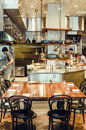 Gibson at San Francisco’s Hotel Bijou. Photo by Kane Andrade Leif Billings, regional director, Northeast, at Chicago-based consultancy Next Step Design, says his firm sees no waning of interest in open kitchens among operators. If anything, he sees the trend accelerating.
“At least half of the projects we’re working on right now include open kitchens,” Billings says. “They’re not going away and they’re spreading to segments you might not think would go that direction. For instance, we’re working on a private girls’ school on the Upper East Side of Manhattan that has its kitchen fully open to the cafeteria. That’s not something we would have seen embraced a decade ago.”
Tim Trapp, president and founder of Trapp Associates, a Boulder, Colo.-based consultancy, agrees that interest in open kitchens continues to grow. While cooking shows and celebrity chefs have fueled the trend in the past, he sees consumer interest in the farm-to-table movement now supporting it as well.
“It’s become such that you want to make that barrier between the food and the making of the food and the guest as transparent as possible,” Trapp says. “Some operators are taking it to the point where you can barely tell where the dining room ends and the kitchen starts, other than the floor finish. Guests are right there near the action, and some of the most popular seats in the house are those closest to where the food is being cooked and plated.”
Indeed, as the popularity of open kitchens grows, design approaches become increasingly creative and versatile. Open, after all, can take many forms. It might be a simple peek-a-boo window offering guests a glimpse of the activity inside. It might be almost laboratory-like, with floor-to-ceiling glass walls enclosing a quiet jewel box of a kitchen. Maybe it’s a more traditional front counter facing an open back cookline or raw bar. Or it could be a full-monty, no-walls iteration that takes the concept of an open kitchen to new and more immersive extremes.
Fully Open, Highly Engaged
Such was the idea behind the kitchen at Gibson, a contemporary American restaurant and bar with an art deco vibe in San Francisco’s four-star Hotel Bijou. Opened in October 2017 after extensive renovation of ground-floor space not previously used as a restaurant, Gibson touts live-fire cooking showcased in a fully open, no-barriers kitchen.
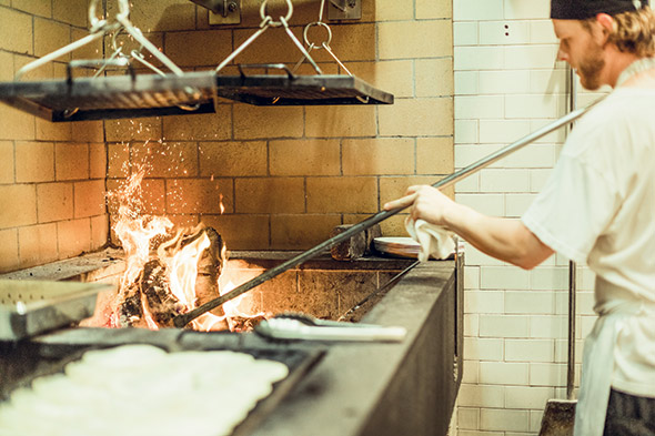 Gibson at San Francisco’s Hotel Bijou features a no-barriers open kitchen showcasing live-fire cooking. Photo by Kane Andrade
“The whole thought behind the design of the kitchen was to give our chefs and cooks the ability to interact with guests,” says Kunal Sikand, co-owner of the Hotel Bijou and Gibson. “We didn’t want a stuffy restaurant where front of house has no idea what back of house is doing and the people preparing the food have no contact with the people who enjoy it.”
To that end, Gibson not only eliminated physical walls between the dining room and kitchen, but it also revised the traditional rules of service to maximize the impact of its open kitchen as a differentiator. Removing the last mile of separation between chef and guest, the culinary team not only prepares the food but delivers it to tables as well.
“It creates interaction and a different level of engagement when the chef who cooked your food sets it down in front of you,” Sikand says. “Guests have a chance to talk about the dish, the ingredients and the preparation instead of always going through a server. As such, we had to make sure the space was designed to accommodate having chefs not just cooking but being in and out of the kitchen during service while the rest of the team keeps everything moving along smoothly.”
Gibson’s show kitchen, which comprises roughly 1,000 square feet of the 4,000-square-foot, 102-seat restaurant, has at its center a large, custom island installed around a tile-lined structural column. It includes refrigerated drawers and plate-warming cabinets, a beverage area where chefs create signature culinary cocktails for the bar program, and space for plating and staging completed dishes.
Flanking that island on one side is a traditional hot cookline with gas-fired French top ranges; on the other a cold station. The kitchen’s back wall holds its marquee wood-burning cooking equipment, which includes a large custom grill and hearth-style oven.
“It’s like you’re at a live theater show,” Sikand notes. “You can see live fire along that back wall, you see the stacked wood and you see the fires being tended. Everyone’s cooking and plating at such a high level that it’s like watching a stage production while you’re dining. Guests love it. We get a lot of requests for large groups to be seated right in front of the kitchen because it’s such a fun, interactive experience.”
Multiconcept operator John Resnik wanted that same sense of theater when he and his team designed the kitchen at Jeune et Jolie, a modern French cocktail bar and bistro in Carlsbad, Calif. Opened last December, the dining room and bar of the 2,000-square-foot restaurant remains fully open to an expo kitchen with a large custom cooking suite in the center flanked by cold stations and expo areas on either side. The only physical separation between the front of the house and back is a six-seat, ADA-compliant extension of the bar that’s become popular as a chef’s table.
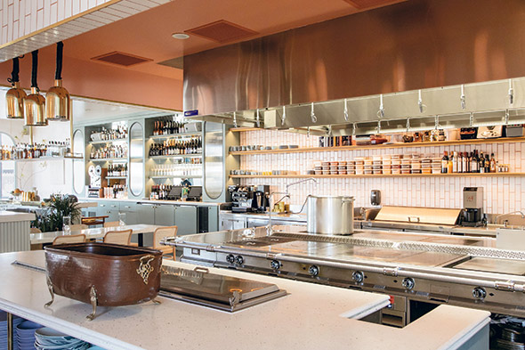 A large custom cooking suite anchors Jeune et Jolie’s fully open kitchen. The only physical separation between the front and back of the house is an ADA-height bar extension that’s popular as a chef’s table. Photo by Lily Glass
“What we were trying to accomplish in terms of the space and the concept is a little bit of dining as theater,” Resnik says. “People used to go out for dinner and a show, but now dinner is the show. We wanted to channel that in the restaurant with an open kitchen, but we take it to a different level. The entire kitchen has no walls separating it from guests. They see everything, and every seat at the bar and in the dining room has a good view of the kitchen.”
To See or Not to See?
Just as in any great theater production, however, open kitchens — whether wide open, like Gibson’s and Jeune et Jolie’s, or more restricted-view, peek-a-boo-style — demand rigorous control of what guests can and can’t see as part of the experience. Smooth backstage operations and management practices that zero in on some of the unique demands of staff for cooking and performing under pressure while in view of guests are critical.
From the design standpoint, when considering whether to include an open kitchen in a particular concept and/or how open a kitchen should ultimately be, Victor Cardamone, president of Mise Design Group in Pottstown, Pa., suggests giving careful thought to exactly what the owner or chef really wants to put on display.
“One of the questions I pose all the time is, ‘What do you want to be when you grow up?’ ” Cardamone says. “The kitchen typically is the action point, whether it be fire on the grill or the jump of the saute pan. If that’s primarily what you want guests to be able to see, your design starts there. And there’s been an evolution. Ten years ago, everyone was so excited about open kitchens and wanted to just expose everything. A lot of lessons have been learned — sometimes the hard way — since then. Controlling or minimizing what you don’t want guests to see is just as important, if not more so, as putting on display what you do want them to see.”
Among the strategies that Cardamone uses to add a measure of sight-line control in open kitchen projects is to slightly raise or lower the workspace relative to seating areas. At Korus Restaurant & Lounge in Beirut, for instance, the long, linear kitchen, some 60 percent of which customers can view, includes a cooking area that’s elevated roughly 18 inches above the main floor.
“The chefs’ workstations are facing the dining area, so customers can see what the staff is doing right in front of them, but because it’s elevated, they really can’t see much behind that front line,” Cardamone says. “At another project, we did just the opposite — dropping the active open-kitchen cookline floor level several inches, ensuring that guests can see food cooking on the top of the grill but not what can often be a messy-looking view below, especially during busy periods.”
At Gibson, despite its no-walls design and fully exposed kitchen, the culinary staff carefully choreographs and controls the sights and sounds of food prep. That’s thanks in part to a separate, out-of-sight support kitchen that resides one floor below. This space includes walk-in coolers, where the bulk of prep and protein fabrication takes place, according to Sikand.
“We bring everything up to the main kitchen ready to cook or finish,” Sikand says. “When you’re on the main floor, you see everything clean and ready. As in theater, we want guests to see exactly what we want them to see and no more. Everything else happens backstage.”
That principal applies as much to sounds as it does to sights. While some sounds — pans sizzling, dishes clattering, chefs communicating and, in Gibson’s case, fire crackling — add to the experience, others are definite detractors. Among them is refrigeration, Sikand says.
“All of the refrigeration within our main kitchen operates remotely. The lines run to the downstairs kitchen, which is where the condensers are. Along with having to install separate exhaust systems for gas- and wood-fired equipment, it’s an important part of the infrastructure that we had to get right from the start,” Sikand says. “You don’t hear any noise from refrigeration upstairs and we also have none of the heat there that’s typically generated by refrigeration.”
Matt Camilleri, managing director at Boston-based RealFood Consulting, sees a couple of parallel trends in open-kitchen design and operations. Among the hottest, embraced by operations like Gibson and others in the independent, chef-led segment, is live-fire, solid-fuel cooking. “We’re seeing a lot of really awesome custom grills being fabricated, ranging from 7 to 12 feet long. We’re also seeing a lot of solid-fuel hearth ovens, which can be nicely customized and are being used for much more than just pizzas. These are very cool showpieces in open kitchens that are designed to provide unobstructed views of the action on and around them,” he says. “Chefs really like to show them off and they create a lot of excitement.”
On the flip side, however, Camilleri sees growing interest in open kitchens that aren’t quite so open and that enable operators to balance showmanship out front with efficiency in back. Labor, he notes, is a big driver, as operators face the reality of having to staff their kitchens with fewer employees.
Finding Balance
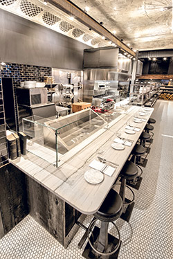 Encompassing almost the entire back wall of the dining room, the kitchen at Ledger includes a raw bar with counter seating at one end and a hot cookline with a solid-fuel grill on the other.“On slow nights, you might need to have just a couple of employees working the kitchen. While inviting and energetic during busy weekend shifts, that same vibe won’t necessarily be activated on a Monday or Tuesday night when fewer tables are full and an open kitchen is operating with a skeleton crew,” Camilleri notes. “That’s not particularly sexy in terms of experience.”
And to keep rising labor costs in check, many operators now rely more on technology and on equipment such as precision-controlled cook-and-hold ovens, sous vide and combi ovens. “They’re not particularly sexy, either,” Camilleri notes. “Guests don’t really want to see chefs pulling a preroasted chicken out of an oven before breaking it down and plating it. They want to see it coming off a solid-fuel grill or a rotisserie.”
Some operators intent on open-kitchen concepts find a happy medium, installing high-efficiency, low-labor equipment in back and finishing dishes on or in showpiece equipment out front to sell the sizzle.
At Ledger, a progressive New England restaurant housed in a historic bank building in Salem, Mass., RealFood’s team created a hybrid scenario for the large kitchen along the main dining room’s back wall. Comprising roughly 1,500 square feet, the open kitchen includes a front cold line with double-shelf stainless-steel plate storage and pass-thru and a center hot line with an 8-foot solid-fuel grill on one end and a traditional range on the other. Beyond the range, at the far end of the open kitchen space, sits a raw bar with counter seating for six. Directly behind the hot line, partially visible through a peek-a-boo window in a wall behind the wood-burning grill, is a back kitchen where all of the bulk prep, batch cooking and bakery production take place.
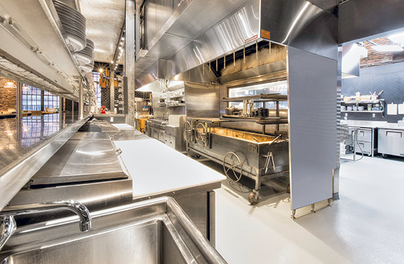 A large pass-thru opening enables guests glimpses of action on the display-cooking hot line at Ledger in Salem, Mass. That view includes watching the action of the custom wood-burning grill. Photos by John Skibbee
It’s a setup that required three separate hood systems: one each over the solid-fuel grill, prep kitchen cookline and gas-fired range.
A visual centerpiece in Ledger’s open kitchen, in addition to the wood-burning grill, is the door to the old bank’s vault. Now sealed on the front side as a brand-enhancing decor element, the vault’s interior space was transformed into the restaurant’s walk-in cooler, accessed by staff from the back.
“We did some did extensive demolition around the vault, which had 2-foot-thick concrete walls around it,” says Camilleri. “[That enabled us to] open up space for the back kitchen as well as for a hallway in back that connects that kitchen to a beverage area and dish station on the other side of the walk-in, behind the raw bar. It’s now essentially one space that flows behind the open cookline from the prep kitchen to the dish room.”
The main kitchen at Chef Jean-Georges Vongerichten’s newest concept, The Fulton, takes a similar conceptual approach but provides even more strategically restricted views. Billings, who led Next Step Design’s work on the project along with Vongerichten, says it’s a take on open kitchen design that’s gaining favor with operators because it checks boxes for ambience and energy as well as for operations and budget.
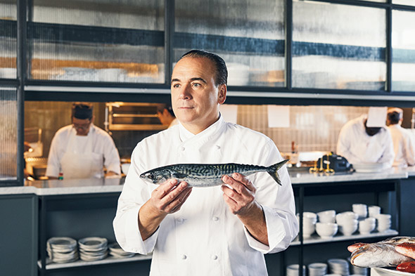 While providing open-kitchen energy, guest views into the hot line at Chef Jean-Georges Vongerichten’s The Fulton are limited to what’s seen through a 20-foot pass-thru window. Translucent glass panels in the kitchen wall suggest additional activity beyond but screen direct views. Photos by Robert Bredvad
Opened earlier this year at Pier 17 in New York City’s South Street Seaport, The Fulton spans two floors, with its main kitchen on the first level and a raw bar with counter seating on the second level. The first-floor show kitchen runs across the back of the dining room and provides views of an open pastry and garde manger station on the left and cold and hot cooklines on the right.
The garde manger station was originally supposed to be located in back, out of view, but space constraints had the designers move it out front. “There just wasn’t enough space in back, but it worked out well,” Billings says. “Within 30 seconds of walking in, guests get a great sense of energy and activity from different angles across the back of the restaurant.”
A separate, small galley-style kitchen behind the hot line keeps batch cooking equipment, fish prep and the dish area out of view.
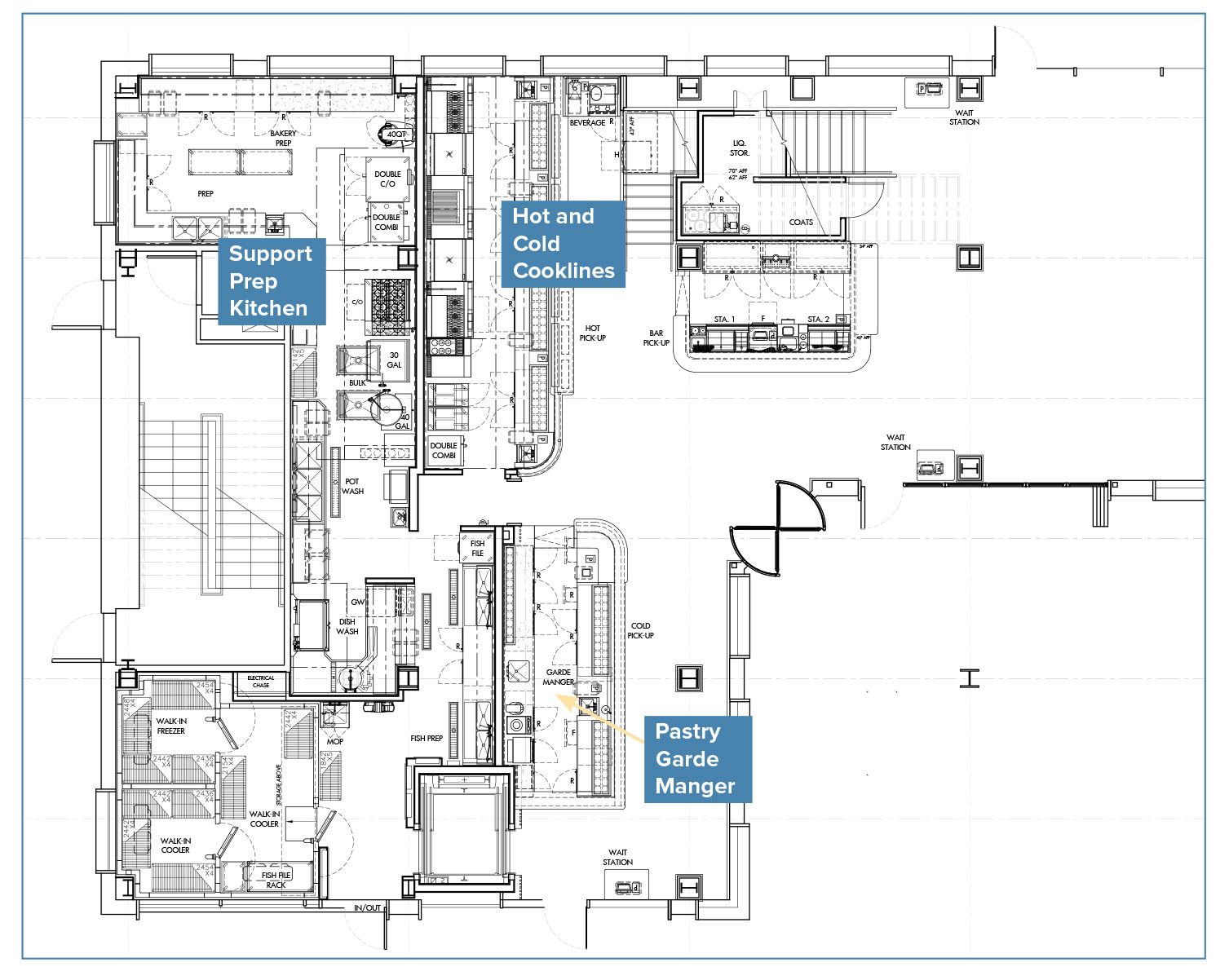 The Fulton's main-floor display kitchen runs across the back wall of the dining room. It includes a pastry and garde manger station and cold and hot cooklines, with a galley-style support kitchen directly behind.
While designed to provide an open-kitchen experience, views into The Fulton’s 28-foot hot line are limited to what’s easily seen through a picture-frame-style, 20-foot pass-thru window. It’s cut into a wall that, on the guest side, has millwork shelving for plates below and ribbed-glass panels above. “The glass is translucent, so you can see activity behind it, but it hides the things you don’t necessarily want to see,” Billings says. “And the pass counter is 44 inches high, so it hides everything on the front side of the cooking line.”
That design approach, Billings adds, effectively controls sight lines into the kitchen but also helps to keep budgets under control.


