This next-generation salad bar has rolled out a new prototype that emphasizes the quality of its ingredients and offers opportunities to upsell.
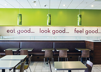 Salata’s new furnishings include hardwood chairs, stainless steel tables and booths with sharper angles.Two years ago, fast-casual salad chain Salata did something many other operations would consider crazy. During a period of rapid growth and strong interest from potential franchisees, it stopped selling new stores.
The intention wasn’t to become an exclusively company-owned concept, says David Laborde, the chain’s executive creative and purchasing director. Instead, Salata’s leadership realized that to succeed long-term, they needed take a hard look at their operation, from food sourcing to franchisee support. Because this effort required leadership’s full attention, franchise sales came to a halt.
As it moved forward with this process, the Salata team identified several necessary changes to implement in the chain’s restaurants. Equipment had to be standardized, the menu board reworked to accommodate calorie labeling requirements, furniture changed to better fit Salata’s image, and on and on.
At some point, Laborde recalls, the development team realized all these individual changes pointed the burgeoning fast-casual concept in the same direction. “I was working with our creative team and it just ended with us saying, ‘Let’s just redo the whole thing.’” The result is an entirely new prototype that operates more efficiently, offers natural points for upselling and better reflects the Salata brand.
Eating Clean
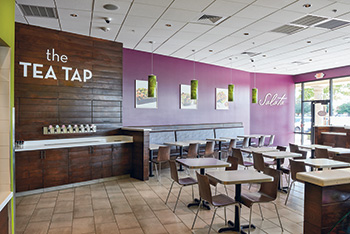 The key colors in Salata’s new prototype are plum and lime green — both holdovers from the previous design.Based in Houston, Salata bills itself as a next-generation salad bar. Instead of asking diners to assemble their own salads and then pay by weight, Salata has its customers walk down a line and tell an employee exactly which ingredients to add to the order. When their dish is finished, they’re charged not by weight, but by what they ordered: a small salad, large salad or wrap.
Salata works to distinguish the concept through its ingredients. Salata has established strong relationships not just with its vendors but with its growers. And with more than 50 options on its serving line, the restaurant prides itself on offering fresh, high-quality food. With the redesign, Salata wanted to drive these factors home.
Everything about Salata’s front of the house now says fresh and clean. In the redesign, the chain kept two of its signature colors, plum and lime green, while ditching a gold that was darkening the restaurant. That color has been replaced by bright white subway tile on the wall behind the serving line. Not only do these tiles brighten up the front, they also serve as the backdrop for one of Salata’s new catchphrases, which appears on the wall in large acrylic letters: “eat good...look good...feel good.”
Salata’s prototype also features updated furnishings. The chain uses stainless steel tables and wood chairs. (The chain previously used plastic chairs.) Hardwood booths have replaced laminate versions. While still upholstered, the new booths feature cleaner lines that mesh well with Salata’s overall brand identity, Laborde adds.
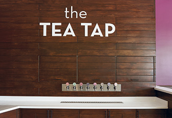 Salata has introduced gravity-fed “tea taps” in an attempt to improve beverage salNot all of the changes to Salata’s prototype were purely aesthetic, of course. One major addition addresses a weakness in Salata’s operation: its beverage sales. Salata has a higher-than-average rate of customers who order a cup of water. That’s understandable: people who get a salad for lunch or dinner are going to gravitate toward a healthful drink option. To cater to these customers, Salata has long offered lemonade and healthful, zero-calorie teas — and never any sodas.
Even with these better-for-you options, though, Salata’s beverage sales are lower than where the chain would like them to be. Laborde and his team decided to redesign the beverage station. “The impetus for us was to help increase our beverage sales and also try to add another cool element to the store, an interactive piece for the guests,” he says.
The solution: Salata’s new “tea tap” station. From the customer perspective, it looks and works just like beer taps at a bar. Diners simply walk to the station, look over their options — typically three teas and three lemonades — and pull their preferred tap.
With the ideal design, large bins of tea reside in the back of the house directly behind the tea tap’s back wall. The gravity-fed system pipes the tea into the taps, and staff can easily refill bins. When that’s not possible, the chain has engineered a shelving system hidden by a wooden cabinet that holds the tea bins.
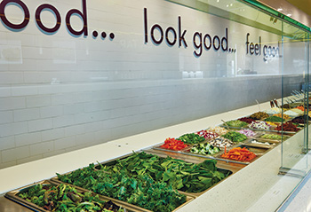 The chain’s new prototype uses sandwich tables that raise salad ingredients up several inches, drawing attention to the quality of Salata’s products.Only a handful of Salata locations use the tea tap system so far, but the initial results continue to be positive, with beverage sales jumping substantially at those locations, Laborde says.
While the tea taps were a major addition to the prototype, another big change was a subtraction — specifically, subtraction of the menu board. The board, Laborde says, was becoming a problem for the chain. The sheer number of ingredients Salata offers combined with calorie labeling requirements made the board a major logistical challenge.
What’s more, customers tended to ignore the board and instead focus on the colorful ingredients on the serving line. Salata decided to place menu options and ingredient information where people naturally look. Vinyl stickers that now sit on the food shield show what’s available, while stickers on the salad line’s stone countertop identify individual ingredients and their calorie counts.
This change now gives people information where they naturally look, while also providing Salata with some flexibility, Laborde adds. “If I put out an LTO and put pecans on the line, I just move a little sticker around. I don’t have to worry about changing my menu board.”
In addition to the menu board’s removal, the serving line’s design and equipment have changed to draw customers’ eyes to the ingredients themselves.
The food shield, for instance, used to have vertical brackets that would connect one panel of glass to another. In the new prototype, the shield works without these brackets. By placing the individual glass panels directly against each other, the shield appears seamless. With no visual interruptions, the whole ingredient display looks more impressive than ever.
Updated cold tables also emphasize Salata’s ingredients. Previously, the chain bought sandwich tables from a number of different manufacturers. Now, it uses one brand. According to Laborde, this firm won Salata’s business by making tables that place the top of the wells completely flush with the table’s highest point. As a result, Salata’s produce and proteins have been raised up just a few inches, making them pop that much more.
The ingredients line starts with three refrigerated sandwich tables, with undercounter refrigeration holding backup ingredients. Like nearly all the drop-in pans on top, the backup storage bins hold 32 ounces of product, making refills simple.
The first ingredient customers choose is lettuce, with the option of any combination of five different types. They then have their pick of the more common salad toppings (tomatoes, cucumber, etc.) followed by more specialty toppings, like jicama or sun-dried tomatoes.
Next, they can choose up to 2 of Salata’s 11 dressings, followed by proteins. Among these are turkey, four chicken options and four types of seafood, including salmon and shrimp. The chain also offers quinoa, tofu and falafel as vegan protein.
Following the three sandwich tables sits Salata’s toss station. Previously, this station was made up of basic stainless steel tables. “You had components resting on it. Toaster, steam [wells] for soups. It was a kind of mountain range of heights and nooks,” Laborde says.
The new prototype replaces these tables with a custom-made unit that has built-in wells for soups and items like pita chips, croutons and sesame seeds. It also has dedicated, built-in spaces for holding tortillas and disposables. The result is an area that reinforces — rather than detracts from — Salata’s clean look.
The toss station consists of two sections. The first holds soups. With both cup and bowl sizes, this section provides a natural opportunity for employees to upsell, Laborde says. The staffer at this section can also toss and finish the customer’s salad — a good option for gluten-free customers; up until this point, none of the ingredients on the serving line have contained gluten, Laborde notes.
The second section of the tossing area has items containing gluten, including croutons and pita chips. The staffer at this station will add these finishing items, toss salads, press tortillas and roll wraps. The staff member will place completed salads and wraps in disposable, recyclable containers — with lime green bottoms and clear tops — which are handed to customers at the cash register.
Slicing and Dicing
Supporting the front-of-the-house action is a back-of-the-house prep area. Since Salata’s menu consists of mostly cold items, 80 percent to 90 percent of the prep work occurs before 10 a.m. Staff place prepped ingredients into cold storage and access them when necessary.
As a salad concept, the chain’s prep focuses on cleaning and cutting vegetables. The simple and efficient cold prep station consists of two six-foot work tables and two vegetable sinks. Smallwares include knives and cutting boards, as well as various “slicers and dicers,” Laborde says.
In certain instances, Salata staffers will cut produce by hand. For example, try machine dicing out-of-season strawberries, and you’ll end up with strawberry jam, Laborde notes. Other times, Salata simply prefers that its produce be hand cut. While it may take longer, he adds, hand cutting reinforces the Salata experience by producing food that looks and feels more authentic and less processed.
This approach also gives team members more ownership of the product, Laborde notes. By doing the work themselves, staffers become more invested in the quality of the food they serve. Ownership is driven home by an interesting rule of thumb in Salata’s operations: The person who prepped the ingredient in the morning is the same one who serves it on the line.
“If I’m going to cut up mushy tomatoes, I’m going to have to look you in the face and put them on your salad,” Laborde says. “I think part of that subliminally helps. We have staff all the time say, ‘No, no, no. This isn’t right.’”
While the cold prep setup generally remains the same after the redesign, the hot prep has changed significantly. The area used to have three pieces of hot equipment: a grill, a conventional oven and a two-burner range. Now, the grill and conventional oven have been replaced by a single combi oven.
The chain uses the combi to do nearly all of its cooking, including crisping pita chips, baking chicken and even poaching salmon. It also makes it easier for Salata to roll out new menu items. After developing a recipe that uses the combi oven, Salata’s culinary team can email it. Then, staff at each location can load the new recipe into the combi ovens using a thumb drive.
At that point, all staffers need to do to deploy a new item is season the food, place it in the oven and push a few buttons on the control panel. “As a product development person, it’s the coolest thing ever,” says Laborde.
Coming Soon
With the chain’s new prototype in place, Salata is nearing the point of selling franchised stores once again. It initially will focus on building out its footprint in Texas, as well as in Chicago and Los Angeles, where it also has stores, says Laborde.
In addition to the new prototype, any franchisees that come on board during this period will also benefit from the work Salata has done to improve its franchisee system. One highlight of this system is the creation of corporate training centers. These centers will allow the chain to get new franchisees up to speed easily and train/retrain managers quickly. They will also serve as miniature corporate offices to their markets, providing whatever support they can.
The chain has ambitious goals and has done all it can to make them reachable. In doing so, this next-generation salad bar could be the next big thing in healthy eating.
Key Players
- Leadership: Berge Simonian, Owner; Tony Kyoumjian, Owner; Iris Campos, Executive Director of Shared Services; David Laborde, Executive Creative and Purchasing Director
- Interior designer: Joint collaboration between Norton Creative, David Laborde and Salata Graphic Designer Zarina Shah
- Kitchen design consultant: Joint collaboration among Concept Services, Berge Simonian, and David Laborde
- Equipment dealer: Concept Services
Facts of Note
- Chain headquarters: Houston, TX
- Year founded: 2005
- Signature menu items: Salads and wraps with
house-made dressings, soups and sauces - Number of units: 52
- Unit size (prototype): 2,600 sq. ft. (1,500 sq. ft FOH;
1,100 sq. ft. BOH) - Seats: 60
- Location type: Inline, end-cap and free-standing
- Total system sales: $48 million in 2015
- Average sales: $1.1 million
- Unit growth projections: 20 units in 2016
- Check average: $12.50
- Equipment package cost: $140,000 including furniture

