A new brand position and new prototype that focuses on back-of-house efficiency and food safety are redefining this 22-year-old seafood chain.
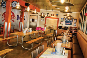
 Some Joe’s units have an enclosed patio, complete with picnic tables, reminiscent of the seaside crab house experience the chain wants to offer to its customers.For Houston-based Joe's Crab Shack, the past 12 months have been among the most active in the chain's history. In May of last year, Joe's parent company, Ignite Restaurant Group, completed its initial public offering. In November, Joe's chose a new advertising agency of record, McCann Erickson New York; and in February, the chain took on a new president and a new brand position.
Of course, to the average Joe's customer the new brand position — "100% Shore" — and all that comes along with it are what matter most.
The original Joe's founders got their inspiration for the chain after dining at seaside crab houses during a visit to Galveston, Texas. Though the concept has changed hands in the 22 years since its launch, this new campaign represents a return to that beginning. "'100% Shore' is really about us getting back to our roots as a crab shack, a Gulf Coast company," says Jim Mazany, the new president of Joe's. "It's paying homage to where we come from, from a brand perspective. We're an American crab house with locations across the United States."
The campaign's first commercials, which began airing in February, feature scenes from mom-and-pop seaside crab houses — a handful of seasoning tossed into a pot full of steaming crabs, happy customers sitting at picnic tables while cracking open crab legs — with a narrator tying the seaside crab shack experience to dining at Joe's.
According to Mazany, with the campaign, Joe's is repositioning how customers approach the brand. By embracing its crab shack roots, the chain wants customers to think of it as a place where they can come for a unique seafood experience at any time, replacing the perception of Joe's as a special occasion restaurant. This new brand position has more behind it than just commercials, though. In 2010, Joe's launched a new prototype restaurant that, while developed before "100% Shore," clearly aligns with the new ad campaign.
Take the new front-of-the-house design: In Joe's legacy system, the bar area was placed in the restaurant's corner, but new Joe's units feature the bar front and center, embracing the natural pairing of crab legs and cold beer one would find at a seaside crab house. This new design, says Mazany, places the walk-in cooler that holds kegs of beer directly behind the bar, allowing the restaurant to improve its drink offerings. "We don't have to use a glycol system. We draw right out of the kegs. We're able to serve beer at the optimum temperature, but it also has the shortest run you could imagine, just three to four feet," he says.
Another touch that fits in with the "100% Shore" campaign is the new dining tables Joe's has rolled out. Replacing basic acrylic tables are tables with nautical maps of the area where the unit is located. The maps, Mazany says, reinforce the chain's crab house roots while serving as a talking point for employees and a conversation starter for guests.
Joe's most obvious embrace of its crab shack heritage, though, comes in the form of something rarely seen in customer dining areas: handwashing sinks. These large stainless steel sinks, with metal grates below and tile walls behind, are located at several points in the front of the house and allow patrons to easily clean up both before cracking into a bucket of crabs and afterward — when they're done with their meal and all the steam, juices and bits of shell that come with it.
The handwashing sinks, along with other touches like the special tools for opening crab, and buckets at each table for disposing of bits of shell and used napkins, offers Joe's customers more interactive meal experiences than they'd find at most casual restaurant chains, says Mazany. "They'll walk away with a memorable, unique experience that they won't be able to get anywhere else."
FOH Charm, BOH Efficiency
Of course, any significant restaurant redesign involves not just changes to the front of the house, but to the back as well, where new equipment and processes can be implemented to improve multiple aspects of the operation. At Joe's one of the most significant changes in the back of the house involves how food is received, stored and prepped.
Under Joe's legacy system, crab dishes like steampots — large pots filled with ingredients like crab legs, potatoes, corn, lobster and mussels — were prepared at a standard prep station. In this process, crabs, which were received refrigerated after they had been steamed, were placed on ice, and kitchen staff would portion them along with other ingredients into small plastic nets for rethermalizing once ordered. In the new prototype, this prep work takes place not in the kitchen, but in a walk-in refrigerated prep room, a change that Mazany says "just screams food safety."
Inspired by butcher shops and steak houses that cut meat in a temperature-controlled space, the refrigerated prep room includes a three-compartment sink for washing brine off crabs and cleaning vegetables, along with worktables where BOH team members use vegetable peelers to nick the spines off crabs and portion various seafood dishes. Staff place the steampots in color-coded plastic nets; these identify the exact dish, sealed by color-coded zip ties that also tell the day the dish was prepped.
The prep room itself is part of a larger walk-in system. While the exact layout varies from unit to unit, typically this walk-in system is L-shaped, with the larger portion of the L sharing a wall with the hot cooking line. Each component of this series of walk-ins is separated by doors and air curtains that activate when a door opens, and each has its own cooling system.
At one end of this line of walk-ins sits the freezer. Here, depending on the layout of the individual unit, deliveries are received from refrigerated trucks, reducing to mere seconds the amount of time perishable food is unrefrigerated. From there, food is distributed to its proper storage area.


