In my last blog I discussed the emerging concept of dark kitchens. As a follow up, I would like to share some thoughts about kitchen designs in the dark side.
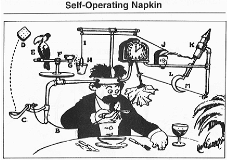
The nice thing about dark kitchens is that operators can focus more on the functional aspect of the concept (how it works) because they don’t have to worry so much about the form aspect (what it looks like). Think about it. This may be an operator or kitchen designer’s best chance at finally executing a Rube Goldberg design.  An invention drawing by artist Rube Goldberg
The end product may not win a retail design award, but as long as the design delivers on the consumer experience (service, quality, accuracy, etc.), it does not matter. Since no customers see the kitchen, there is not as much pressure to make the concept look cool or visually appealing. Projects like these can certainly skew toward the functional aspect of design to drive efficiency of labor, process, procedures and speed of service, among other customer experience areas.
One way to maximize functionality is to use the vertical space in each of the work stations to drive efficiency in the design. Perhaps the stations won’t look as pretty as what one would see in a “non-dark kitchen” but on the dark side, it does not matter. As long as it functions and optimally accounts for the limitations of the employees by using appropriate ergonomic design principles, it will be fine. In this case, beauty has more to do with effectiveness and efficiency than aesthetics.
Station Location
Dark kitchens also give designers increased flexibility in terms of where they locate any station — including three-compartment sinks, prep tables, food processing equipment and the like — since operators don’t have to keep anything from the guests’ line of sight. If by placing a prep station near a product assembly station, or near a cooking battery, you can drive labor or service, or quality efficiency, just do it. As long as it drives a positive impact in one of the operating parameters (processes and procedures, platforms, people, place, products, promotions) the dark side will allow it. If this otherwise uncommon adjacency in a non-dark design enables better labor “slide deployment,” dark kitchens will welcome it since guests will never see whatever tasks take place at prep or assembly stations.
Despite their name, dark kitchens allow a very open kitchen design because the design does not factor in what the guests will see because all they see is the finished product — in their home or office.
In a typical design process one aspires for a careful balance of form and function. As we apply Industrial Engineering in Foodservice to dark kitchen designs, we do not have to balance (often fight) the retail side. In typical (non-dark) designs, sometimes we must sacrifice a bit of functionality and efficiency to make the concept appealing to the customer’s eye. In the dark side, you can push form big-time. The design still needs to drive efficiency in all the areas, however, since although the customer does not see the kitchen, if it is not designed in an efficienct way, they may still feel the impact via the outcome. So making sure that the “dark kitchen” delivers in the brand promise is critical.
In the dark side, form can definitely follow function almost 100 percent of the time.


